2BD Corporate ID – The usefulness of a business card
Corporate identity, like so many things, has become increasingly focussed on the digital aspects of branding. That said, for small business and especially start-ups there is still a lot to be said for the usefulness of a business card.
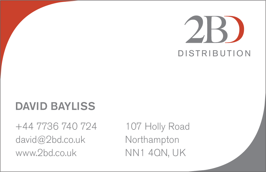
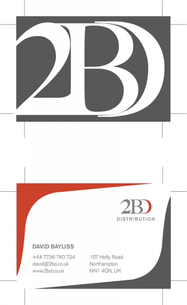
The usefulness of a business card is beyond doubt. A good business card works hard for you and your enterprise. It creates an impression and imparts a lot of useful information all condensed into 85 x 55 mm. For 2BD, I wanted to work with a purely typographic image that would be immediately recognisable while saving the rear of the card for all of the necessary corporate details.
My preferred solution was to do something that you rarely see on a business card, a photograph. Failing that I wanted to reduce the typographical elements until they became a purely graphic entity.
The client drew the line at the idea of a photo on the back of the business card so text as graphic it was.
I ended up overlaying the characters on top of each other and then enlarging them. This meant that they were severely cropped at the edge of the card.
The graphic flourish on the information of the card came about as a happy accident. I initially wanted to have those bleeding off the corners of the card. However the client didn't really like the visual. When I was tried to delete them from the artwork I ended up reducing them by accident.
This resulted in the basis of the final image with the two corners framing the text.
Victorian Pleasure Gardens History Boards
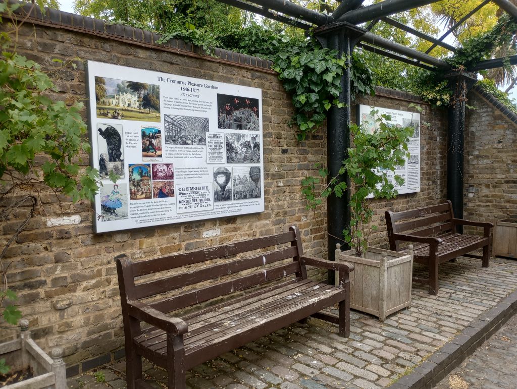
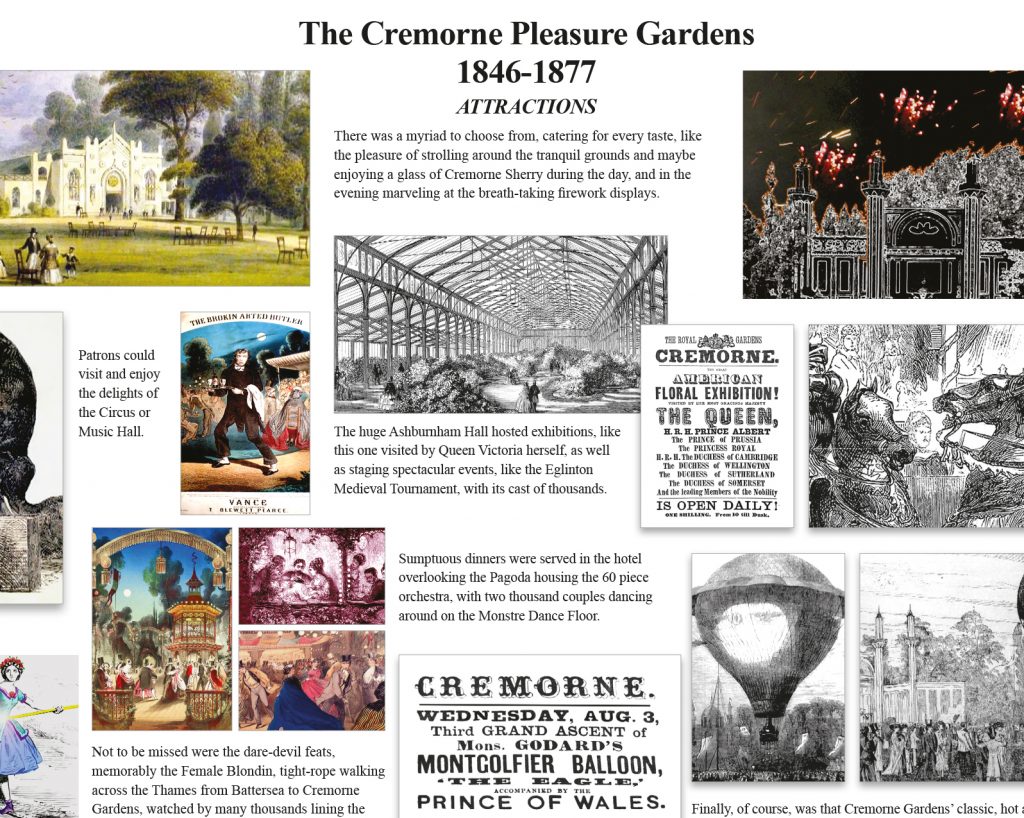
Cremorne Gardens was among the largest and most notorious of the many pleasure palaces that dotted London throughout the mid to late Victorian era. The Victorian Pleasure Gardens History Boards at Cremorne are a testament to the original park's history.
For more than three decades after it's opening in 1845, the park provided an extraordinary array of entertainments and events to the newly wealthy middle classes. They created an range of entertainments going from coffee by the river to a full-scale recreation of the battle of Sebastapol. The gardens eventually closed in 1877, due to local opposition to some the more disreputable aspects on display. Dubious pleasures such as bare knuckle boxing, gambling and prostitution. The idea of creating pleasure gardens history boards was the brainchild of a local resident.
Design
A local historian approached me with an idea to create three boards commemorating the history of the gardens. She planned to locate the boards in a gallery in the modern day Cremorne Gardens, a small public park on the banks of the Thames. This park is the last remaining tiny vestige of the original pleasure palace gardens.
She had already completed the designs but they were nowhere near the standard required for artwork. What she had produced were low resolution scamps created in Photoshop which worked as a starting point.
Artwork
I re-created the boards from scratch, using a 12 column grid to align the somewhat chaotic elements. Grids provide a versatile structure for any changes and additions. My client was working with a number of local museums and other historians. Given the collaborative nature of the project, there were ongoing changes throughout the process.
Creating large boards on a small computer monitor means that you have no idea if they will work. Not once mounted on a wall in real size (the final artwork was 2A0).
Once the initial draft had been completed, myself and the designer went to the gardens. We were armed with a printout of one of the boards, tiled into A4 sheets. Then we spent an hour or so creating a full sized mock-up, taping the sheets onto the wall one by one.
This proved that the boards worked at full size in terms of layout and legibility.
Production
By the end we made a number of revisions and sent various versions to the banner company who would produce the final artwork. As a precaution I asked the banner company to sent me a photo of the final artwork as it came off the press. Normally I would prefer to be present as the artwork is created but that is often just not possible.
As is so often the case, the printers used one of the previous (outdated) versions of the artwork by mistake. However, this showed up on the photo and we notified the company to rectify this.
A psychologist, the tube map and the trouble with narrow definitions
Jordan Peterson is a well known clinical psychologist and self-help author. One of his favourite topics involves the nature of creativity as an aspect of one's personality type. His ideas are well thought out, even though framed within his own North American cultural biases.
As a result of these biases, he sees creative people as liberal and the lack of it as a conservative trait. Moreover, he proposes that pursuing your creativity is a very high-risk strategy in life, which he sees as the hallmark of a more liberal mindset. This brings us to the the trouble with narrow definitions.
The problem with this analysis is not that his conclusions are wrong, but that he seems to be basing them on a very narrow view of creativity. From the way he describes it, Peterson obviously thinks that creativity is uniquely found in artistic expression, and the the trouble with narrow definitions is that they lead to narrow conclusions.
For him, an architect would be creative whereas an engineer would not. A fine artist would be creative but not a draughtsman. He regards it as axiomatic that going to work every day is impossible for anyone of a creative bent. This is not my experience after thirty years of working in the creative industries.
In the early 90s I had the luck to work in the same office as the extraordinary graphic designer, Alan Fletcher. Fletcher understood creativity to be the ability to recognise connections that others simply do not see. However, he also recognised that making those links was a lot more commonplace than people realise. He once said to me that "everyone is a designer" and he was right.
Everyone includes you. Your home, your workspace, your clothes and your entire lifestyle require some degree of creative input. Irrespective of whether or not you flouting conventions, adhere to norms or subvert expectations, you are either choose means of self-expression or simply solve pragmatic issues in creative ways.
Peterson's idea of artistic creativity can also be misleading. An example would be an amateur painter, who is skilled with a brush. They spend their days faithfully reproducing landscapes. Despite appearances, there would be nothing remotely creative about such a person. Artistic yes, in a reductionist sense, but not creative.
So how does this link to the London Underground?
The Tube map – the map of the London Underground – is a creative solution that lies entirely outside of self-expression. Despite the fact that it displays a phenomenal grasp of visual acuity and technical skill, it is representational only as means of wayfinding. If you placed the tube map alongside a picture of hay wains rendered in oil on canvas, we know which one Jordan Peterson would pick as an example of creativity.
However, the Tube map perfectly represents the broader idea of creativity because it involves connections that are not immediately apparent. The map grew out of a need to render a complex system in simple, navigable terms. This is never an easy task and it would have proved to be impossible if not for a purely creative leap.
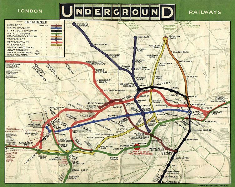
To understand this we have to examine the London Underground itself. Five separate companies built and operated the first tube lines. As a result, they did not get together to creates a composite map until the early years of the 20th century.
The map above was commissioned in 1907 by the five companies who were operating the various lines at that point. It should be noted that even though this early version of the Underground was only a fraction of the complex system that it would become, it was still an incredibly difficult task to represent it realistically against a physical map of London. It's a beautiful piece of work, both in design and execution, but it highlights the problems of rendering a complex system visually.
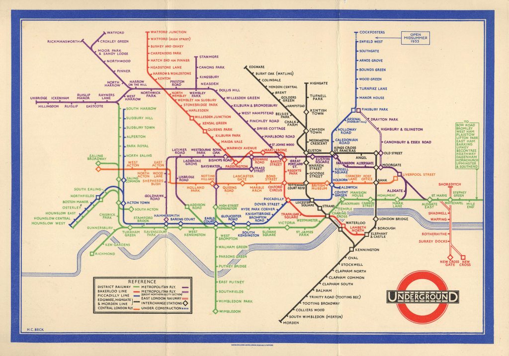
The real Tube map
In the late 1920s Harry Beck, a draughtsman working for the London Underground, made the conceptual leap away from a geographical map to a topographical one.
Whereas geography concerns itself with physical spaces as a whole, topography is more concerned with the individual features of such a space. Beck understood that passengers were not interested in the actual physical distance between stations, only how many stops they would travel and where they should change trains.
His real leap was when he adapted a completely different discipline to meet his needs. He began to lay out the underground system as though it were an electrical diagram. He represented each station as part of a system while ignoring its actual geographic position. Then he incorporated the existing colour coding of lines in order to allow passengers to plan their journeys more effectively. Finally he used his draughtsman skills to realise his ideas.
The Tube map seems obvious to us now. However, when Beck took the idea to his managers they rejected it on the basis that is was too radical. Despite this early setback, once tube travellers got their hands on some test prints there was no going back. Public approval of the map was universal.
From 1933, London Underground mass produced the Tube map for the London public and has done ever since. The map's designers have accommodated all of the extensions and additions to the Tube in the nine decades since it was first introduced. Another testament to it's effectiveness is that virtually every municipal railway project across the globe has adopted the tube map as a template for their own maps.
Why is this important
Creativity is a huge factor in human development. It manifests in writers expressing their innermost landscapes, in teachers communicating with students, with engineers developing systems to bring architects' visions to life, and even for medical professionals searching for solutions within a pandemic.
These are just a few scattered examples of how creativity is intrinsic to progress.
In the end, the trouble with narrow definitions is that we cannot afford to narrow creativity down to artistic self-expression. It won't do us any favours as and when we face the challenges to come.
A tale of two pubs in need of a website – Part 2: The Harbour Inn Arley
The second of the two pubs in need of a website was the Harbour in Arley.
This beautiful pub is situated up the river from the Ship and was a slightly more straightforward job as it is not an inn (despite the name). As the second of the two pubs in need of a website I decided to do this immediately after the ship as it was slightly more straghtforward.
I decided to go for a more layered, old-fashioned look for the site, with rich graphic elements underpinning the backgrounds on the home page.
As with the Ship I was able to leverage the good will of their clientele by using quotes in the page headers.
Thaze Racing – Social Media templates and a break from habit
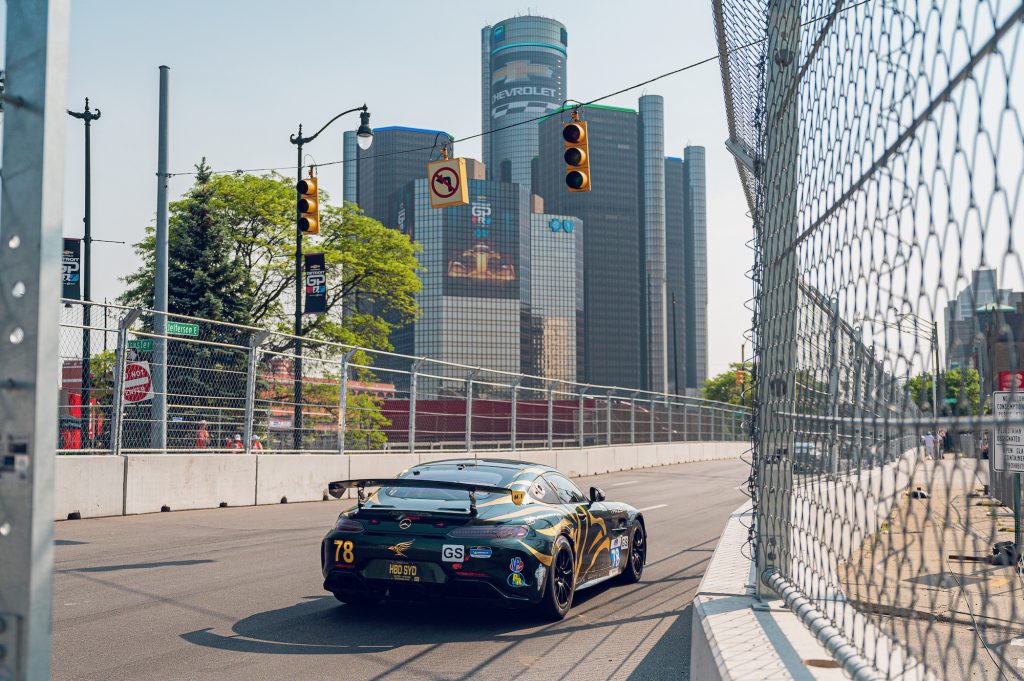
Thaze Competition are a Motor Sports team operating out of Detroit - who in their own words - are taking a fresh and irreverent approach to high octane racing.
They are currently running their gorgeous olive and gold Mercedes AMG in the IMSA Michelin Pilot Challenge series. For Thaze Racing Social Media templates were just another piece of their marketing puzzle, albeit a significant one.
Thaze are the third motor sports company I have worked with in the last 12 months. All three commissions came via 9 Sixty Two Media, a marketing company operating in The USA and Europe.
The client required a number of different social media templates in different sizes Portrait (1080 x 1920 pixels), Square (2025x2025 pixels), and Landscape (1920 x 1080 pixels).
The sizes above would cover social media assets for Instagram, Twitter and Facebook.
The templates would be produced as layered files in Photoshop and cover:
Quotes
Race schedules
Qualifying results
Race results
Although the scope of the document was the same as the previous two jobs, the design approach was somewhat different.
The creative brief for all Thaze Racing Social Media templates included the usual caveats about keeping to the Corporate branding and creating assets that would be distinctive looking, sympathetic to the brand, appropriate to the audience, and of course, legible.
However, the agency wanted to move away from their signature design style, which they felt had been overused in recent projects. The agency favours a chaotic, multi-layered design style, with a emphasis on shadows, patterns, layers and transparent overlays.
The obvious solution was to use a flattened design, inspired by the car livery itself. My idea was to split the assets into two simple and discreet areas for images and text. The border between these lines was a thick curving line to represent a race track.
The only nod to the agency's previous design work and trademark style was a faded watermark of the Thaze logo lying behind the text.
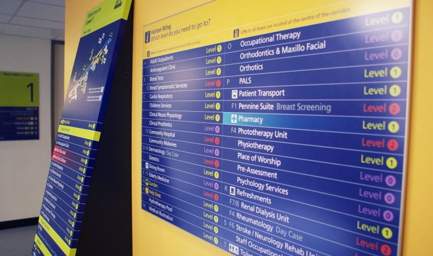
Good signage and your grandmother
I was once told that you should design good signage with your grandmother in mind. The idea was that if you were to drop your granny off in the middle of a building complex, she should be able to get anywhere she wants to go without asking for directions.
Now that may sound patronising to grandmothers. However, in this instance she merely represents the everyman (or woman). Good signage should require no special or esoteric knowledge. You should be able to quickly navigate from any given point to any other point within the system at all times.
The art of wayfinding
Signage is just a method of aiding wayfinding, the process by which human beings orient themselves within - and navigate through - their environment.
We have evolved to be really good at this, so we tend not to think about it too much. The only time it enters our mind is when we get lost, or when we enter a novel, complex environment. This where signage becomes helpful, and in some cases crucial.
There are subtleties to signage that most of us never have to consider. Take motorway signs. They have the specific problem that they have to be read at 70 miles an hour. One of the cleverest ideas that British road sign designers made was to use lowercase letters for place names. This is because when we see a sign saying Bristol, we recognise the shapes of the letters rather than actually read the text. The brain then does the rest. This is much harder to do with capital letters because they form a visual rectangle as in BRISTOL.
Another part of the designer's art is to know when should use symbols rather than words. Some signs are better represented using images because of language barriers - toilets and rest rooms being the perfect example.
Beautiful versus functional
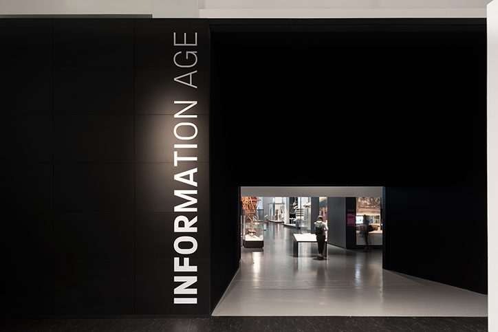
Signage is one of my favourite design disciplines because there is no real trade off between function and aesthetics. Your sign and directions can be useful and beautiful at the same time. The science museum with it primary colours, custom typeface, and integrated design is a great example of this.
But it's the efficiency of signage which makes the difference between success and failure. Nowhere is this more evident than hospitals.
Hospitals are different to most complexes. In a shopping mall or museum, bad signage might cause confusion and delay. In a hospital bad signage might potentially cost lives. The task is usually complicated by the fact that many hospitals were not designed with this in mind. They are often an amalgamation of buildings that grew around the original hospital. They might have been formerly used for other things and then repurposed as hospitals. Only the most modern hospital buildings are designed with the flow of people incorporated into their actual design.
The word "hospital" comes from the Latin hospes, meaning stranger or guest. The word hospitality comes from the same root. My last visit to a hospital involved visiting six different parts of the building and lasted nearly 24 hours. I didn't get lost once and I don't think I am particularly good at navigating spaces.
In the end it all comes down to balance.
The NHS designed their signage with all the right techniques. Colour coding; lowercase lettering; widely spaced lettering (easier to read at a distance); words reversed out of colour panels; desaturated background colours; judicious use of symbols and an excellent use of directional arrows.
The trick is to balance out all of these various elements to produce a coherent message to the patient.
So the next time you are wandering the halls of your local hospital, shopping centre or museum, give a thought to the unsung heroes who are guiding you on your way.
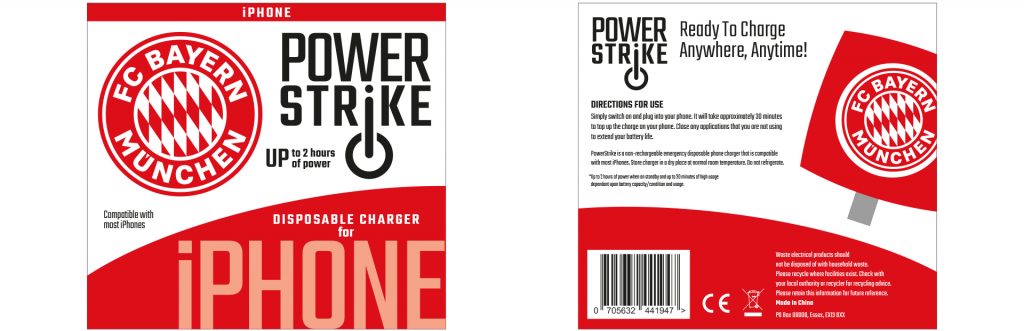
Power Strike – A design for a one-time emergency battery
A brief combining a brand identity and packaging for an emergency power supply for mobile phones.
Power Strike was a product in need of a brand when my client approached me with it. Even the name didn't exist.
What was there was a decent concept. A solution for when the modern world lets you down. It was a small single use battery with a couple of hours power for a mobile phone or tablet. The batteries came with connectors for either android or apple devices. The devices weighed a couple of programmes and were only a couple of inches across, it was the perfect solution of for anyone whose batteries run out when you were far from any any source of power.
I came up with the idea of PowerStrike to highlight its single use capability and the fact that it could be used in situations where every other battery option was exhausted.
The marketing strategy was to co-brand the item for sales in football superstores across Europe so the various packaging demos included samples from Barcelona and Chelsea.
2BD logo – Corporate Identity for an import and supply consultancy.
Brand identity jobs are few and far between for me these days which makes them all the more enjoyable.
I cut my teeth in Brand Identity with Wolff Olins in the early 90s, working on projects for BT, Allied Irish Bank and Vauxhall Motors. But it was at Pentagram that I learned the value of honing a single idea within a logo.
This approach has multiple benefits for both the client and the designer, not least being it focusses the mind on the project at hand.
BD were looking to import white label goods from the Pacific Rim, rebrand them and sell them on to UK retailers. Essentially they would sitting at the centre of both a delivery process and a network of suppliers, designers, transport companies and retail outlets.
This idea of being at the centre of an ever expanding network gave me a place to start visually.
The idea of networking also gave me the idea of using one of nature's great networkers, the bee.
Sometimes, however, the idea just doesn't resonate with the client. In this instance they asked me to go back to the drawing board and I was forced to come up with a new idea.
First of all I went with two B's reflected. This kind of worked but once again the client simply did not like the image.
Finally I looked for inspiration in a another logo, the V&A's excellent logo which simply relies on cut off lettering and negative space.
Finally I had a logo which met the brief and pleased the client. Which only goes to show, that you can rationalise your work as much as you like, but if the client doesn't react to it positively on a visceral level, then you are going straight back to the drawing board.
Your Brand Agency logo – A power symbol, a chain, and the letter B
Creating a logo for a marketing consultancy specialising in new technology.
Your Brand Agency was the brainchild of a Netherlands born business person currently living and working in the UK.
His business idea was simple. Finding markets for emerging technological products and vice-versa. Countries all over the world are getting involved in the current technological revolution. The idea was to find the best and most innovative products, no matter where the were from, and integrate them into the current global marketplace. His surname began with the letter B and gave me a place to start.
The idea for the logo came from another failed idea. I was playing around with a symbol which was based on the letter B mirrored with itself. As I doodled this I began to notice a connection with the universal power symbol (itself a graphic representation of the numbers 1 and 0).
This led me to think that the symbol itself looks a couple of links in a chain. Eventually I came up with the idea of a very short chain made up of over overlaid power symbols which would also represent the letter B.
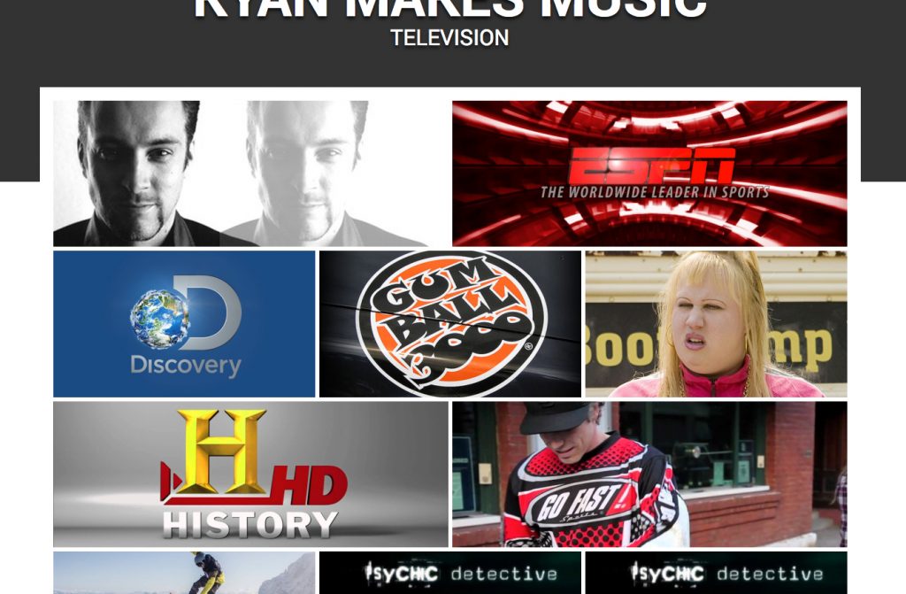
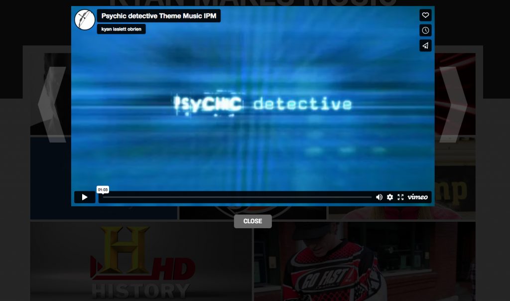
Kyan Makes Music – A website redesign for music composer
Kyan Laslett is a commercial composer working primarily in the TV and film industries. His website provides a portfolio of his work across various platforms.
Kyan came to me because his website had three issues. The design was overly fussy, it did not work across all devices, and although it had a content management system, that system was too complicated for for a non-developer to use (which pretty much invalidates the whole point of having a CMS in the first place).
Simplifying the visual appearance of the site made the remaining tasks easier. Minimal layouts are desirable in and of themselves. However, they also naturally lend themselves to responsive adaptation.
Each page eventually consisted of a mosaic of tiles representing Kyan's work through the years. On PCs and laptops the accompanying text would appear when the user rolled over each image. However, on tablets and phones (where there is no rollover state), the text appeared permanently underneath the images.
The CMS was tricky because the client needed to use a number of different external hosts for his Portfolio samples, Youtube, Vimeo and SoundCloud. Other posts only required still images and text. The CMS had to handle all of these smoothly while the design had to incorporate the different media seamlessly.