Good signage and your grandmother

I was once told that you should design good signage with your grandmother in mind. The idea was that if you were to drop your granny off in the middle of a building complex, she should be able to get anywhere she wants to go without asking for directions.

Now that may sound patronising to grandmothers. However, in this instance she merely represents the everyman (or woman). Good signage should require no special or esoteric knowledge. You should be able to quickly navigate from any given point to any other point within the system at all times.

The art of wayfinding

Signage is just a method of aiding wayfinding, the process by which human beings orient themselves within - and navigate through - their environment.

We have evolved to be really good at this, so we tend not to think about it too much. The only time it enters our mind is when we get lost, or when we enter a novel, complex environment. This where signage becomes helpful, and in some cases crucial.

There are subtleties to signage that most of us never have to consider. Take motorway signs. They have the specific problem that they have to be read at 70 miles an hour. One of the cleverest ideas that British road sign designers made was to use lowercase letters for place names. This is because when we see a sign saying Bristol, we recognise the shapes of the letters rather than actually read the text. The brain then does the rest. This is much harder to do with capital letters because they form a visual rectangle as in BRISTOL.

Another part of the designer's art is to know when should use symbols rather than words. Some signs are better represented using images because of language barriers - toilets and rest rooms being the perfect example.

Beautiful versus functional

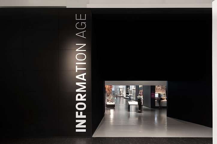
Signage is one of my favourite design disciplines because there is no real trade off between function and aesthetics. Your sign and directions can be useful and beautiful at the same time. The science museum with it primary colours, custom typeface, and integrated design is a great example of this.

But it's the efficiency of signage which makes the difference between success and failure. Nowhere is this more evident than hospitals.

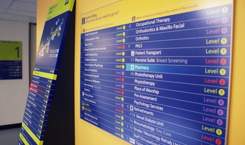
Hospitals are different to most complexes. In a shopping mall or museum, bad signage might cause confusion and delay. In a hospital bad signage might potentially cost lives. The task is usually complicated by the fact that many hospitals were not designed with this in mind. They are often an amalgamation of buildings that grew around the original hospital. They might have been formerly used for other things and then repurposed as hospitals. Only the most modern hospital buildings are designed with the flow of people incorporated into their actual design.

The word "hospital" comes from the Latin hospes, meaning stranger or guest. The word hospitality comes from the same root. My last visit to a hospital involved visiting six different parts of the building and lasted nearly 24 hours. I didn't get lost once and I don't think I am particularly good at navigating spaces.

In the end it all comes down to balance.

The NHS designed their signage with all the right techniques. Colour coding; lowercase lettering; widely spaced lettering (easier to read at a distance); words reversed out of colour panels; desaturated background colours; judicious use of symbols and an excellent use of directional arrows.

The trick is to balance out all of these various elements to produce a coherent message to the patient.

So the next time you are wandering the halls of your local hospital, shopping centre or museum, give a thought to the unsung heroes who are guiding you on your way.

Power Strike – A design for a one-time emergency battery

A brief combining a brand identity and packaging for an emergency power supply for mobile phones.

Power Strike was a product in need of a brand when my client approached me with it. Even the name didn't exist.

What was there was a decent concept. A solution for when the modern world lets you down. It was a small single use battery with a couple of hours power for a mobile phone or tablet. The batteries came with connectors for either android or apple devices. The devices weighed a couple of programmes and were only a couple of inches across, it was the perfect solution of for anyone whose batteries run out when you were far from any any source of power.

I came up with the idea of PowerStrike to highlight its single use capability and the fact that it could be used in situations where every other battery option was exhausted.

The marketing strategy was to co-brand the item for sales in football superstores across Europe so the various packaging demos included samples from Barcelona and Chelsea.

2BD logo – Corporate Identity for an import and supply consultancy.

Brand identity jobs are few and far between for me these days which makes them all the more enjoyable.

I cut my teeth in Brand Identity with Wolff Olins in the early 90s, working on projects for BT, Allied Irish Bank and Vauxhall Motors. But it was at Pentagram that I learned the value of honing a single idea within a logo.

This approach has multiple benefits for both the client and the designer, not least being it focusses the mind on the project at hand.

BD were looking to import white label goods from the Pacific Rim, rebrand them and sell them on to UK retailers. Essentially they would sitting at the centre of both a delivery process and a network of suppliers, designers, transport companies and retail outlets.

This idea of being at the centre of an ever expanding network gave me a place to start visually.

The idea of networking also gave me the idea of using one of nature's great networkers, the bee.

Sometimes, however, the idea just doesn't resonate with the client. In this instance they asked me to go back to the drawing board and I was forced to come up with a new idea.

First of all I went with two B's reflected. This kind of worked but once again the client simply did not like the image.

Finally I looked for inspiration in a another logo, the V&A's excellent logo which simply relies on cut off lettering and negative space.

Finally I had a logo which met the brief and pleased the client. Which only goes to show, that you can rationalise your work as much as you like, but if the client doesn't react to it positively on a visceral level, then you are going straight back to the drawing board.

Your Brand Agency logo – A power symbol, a chain, and the letter B

Creating a logo for a marketing consultancy specialising in new technology.

Your Brand Agency was the brainchild of a Netherlands born business person currently living and working in the UK.

His business idea was simple. Finding markets for emerging technological products and vice-versa. Countries all over the world are getting involved in the current technological revolution. The idea was to find the best and most innovative products, no matter where the were from, and integrate them into the current global marketplace. His surname began with the letter B and gave me a place to start.

The idea for the logo came from another failed idea. I was playing around with a symbol which was based on the letter B mirrored with itself. As I doodled this I began to notice a connection with the universal power symbol (itself a graphic representation of the numbers 1 and 0).

This led me to think that the symbol itself looks a couple of links in a chain. Eventually I came up with the idea of a very short chain made up of over overlaid power symbols which would also represent the letter B.

Kyan Makes Music – A website redesign for music composer

Kyan Laslett is a commercial composer working primarily in the TV and film industries. His website provides a portfolio of his work across various platforms.

Kyan came to me because his website had three issues. The design was overly fussy, it did not work across all devices, and although it had a content management system, that system was too complicated for for a non-developer to use (which pretty much invalidates the whole point of having a CMS in the first place).

Simplifying the visual appearance of the site made the remaining tasks easier. Minimal layouts are desirable in and of themselves. However, they also naturally lend themselves to responsive adaptation.

Each page eventually consisted of a mosaic of tiles representing Kyan's work through the years. On PCs and laptops the accompanying text would appear when the user rolled over each image. However, on tablets and phones (where there is no rollover state), the text appeared permanently underneath the images.

The CMS was tricky because the client needed to use a number of different external hosts for his Portfolio samples, Youtube, Vimeo and SoundCloud. Other posts only required still images and text. The CMS had to handle all of these smoothly while the design had to incorporate the different media seamlessly.