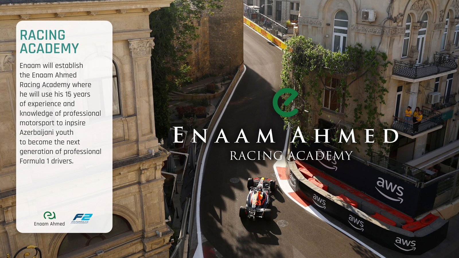
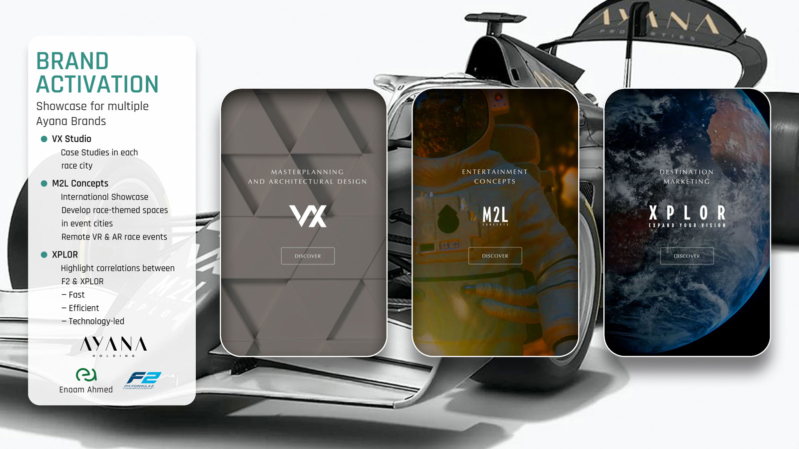
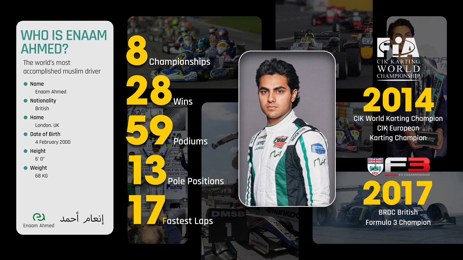
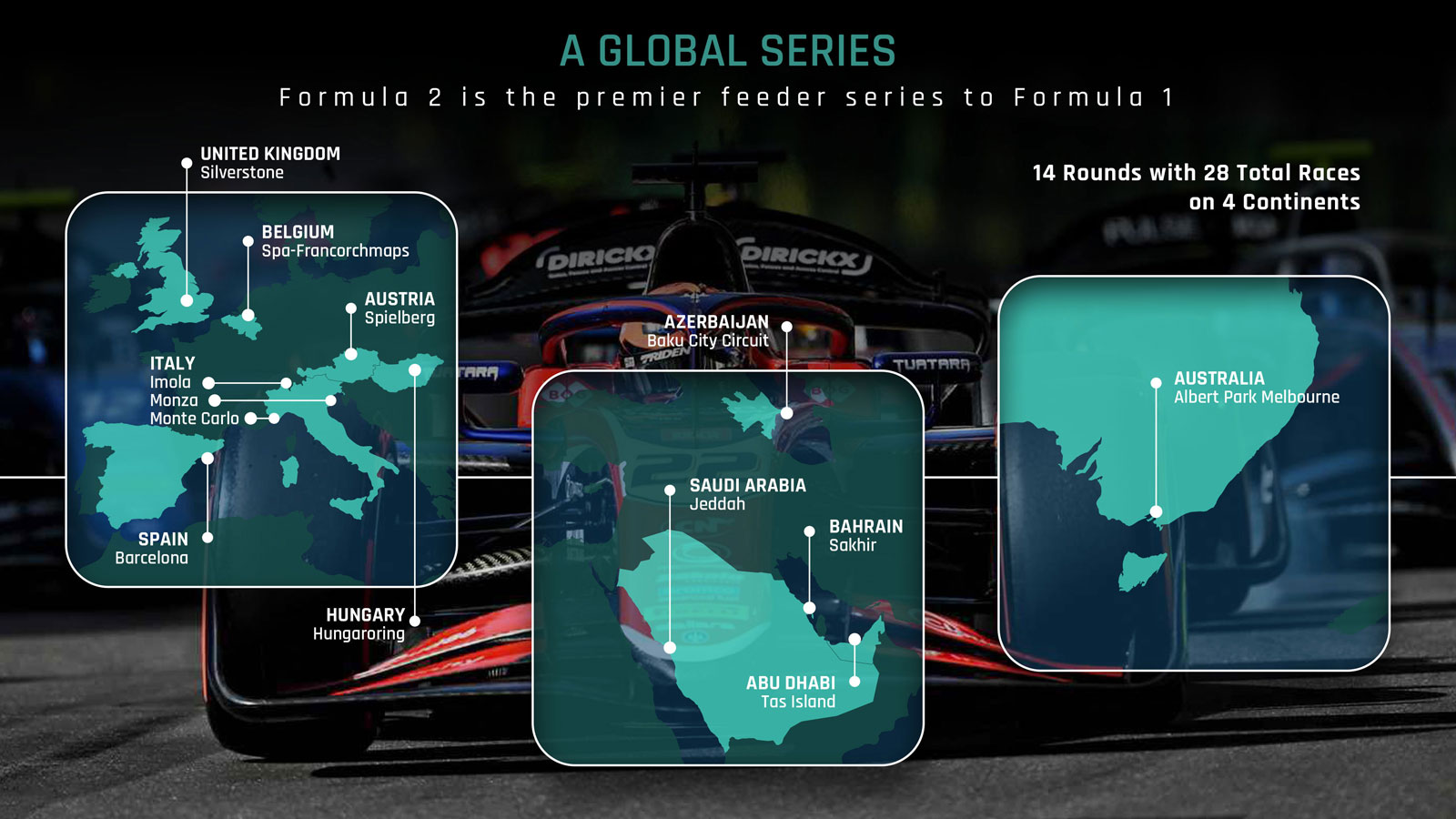
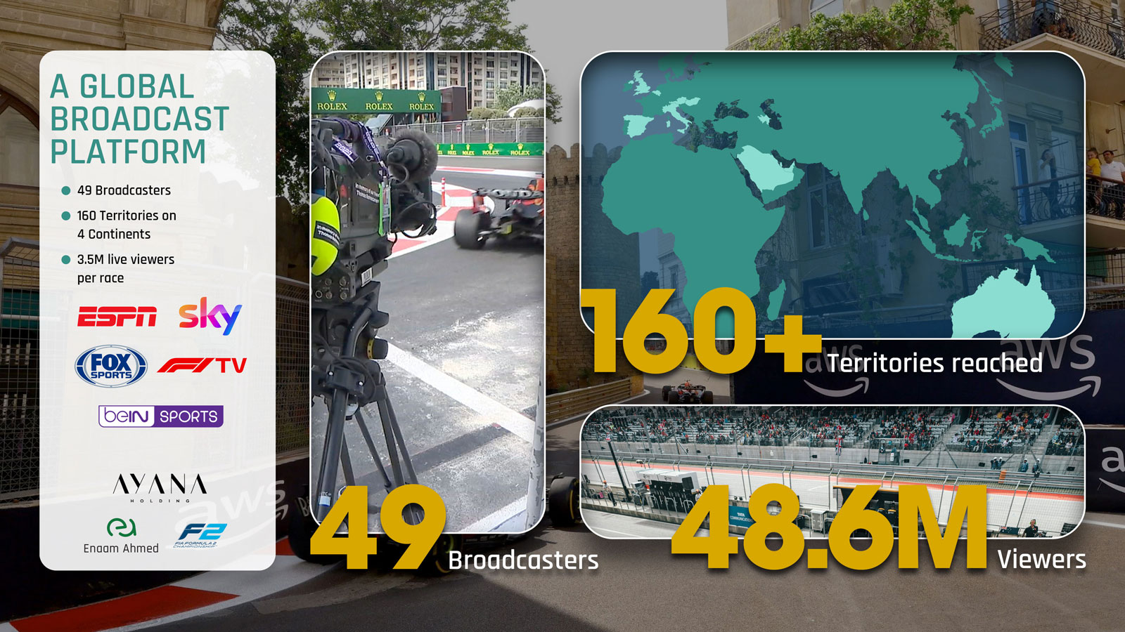
Enaam Ahmed is a British Pakistani racing driver. In 2024 I worked with his marketing agency to create a series of decks aimed at bringing in partners for a push towards Formula One.
The decks were an asset rich tapestry moving through every aspect of Enaam's career and the potential for partnerships within the motor racing industry.
As is typical with motor racing, there was an abundance of assets to work with.
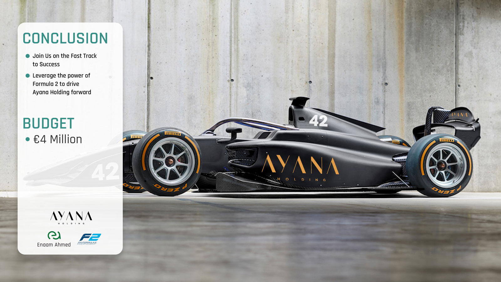
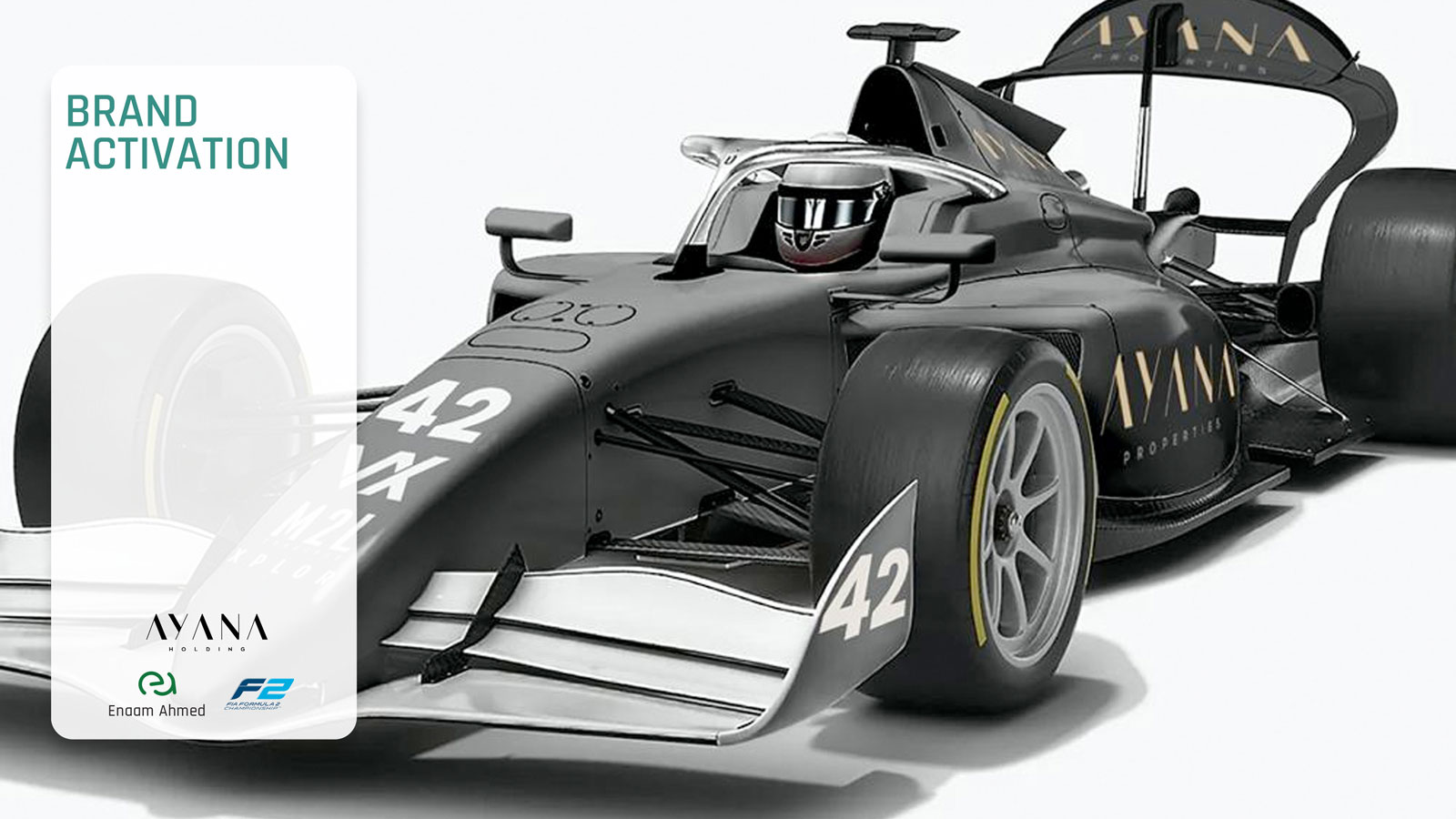
Working on the decks also gave me chance to experiment with creating liveries based on potential sponsors and their corporate identities.
Creating the liveries required a completely different approach to Photoshop, moving from page layouts to compositions. One of the most difficult things was applying the base colour onto a white car model while retaining realistic level of shading.
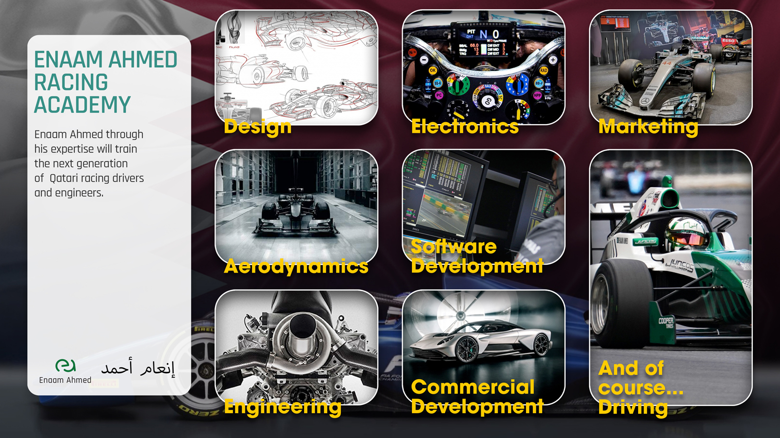
The decks were heavily layered to incorporate inset imagery, timelines and typographical information.
I used the Rajdhani typeface because its mechanical strokes and slightly rounded corners fit the technical aspect of Enaam's sport. The multiple weights also helped in creating emphasis within crowded layouts.
Although the decks were assembled in Photoshop, many of the elements were created in Adobe Illustrator. The integration between the applications proved to be beneficial when dealing with the more complex layouts.
There had been a point where we tried a less saturated version of the display text before moving back to the bright yellow letters.
A Return to Rebel Rock
“The questions are the same, but the answers have changed.” This, possibly apocryphal, quote is attributed to Albert Einstein, when asked why he was giving his students exactly the same exam for two years in a row.
In some ways, this can be adapted for how websites atrophy over time. The site remains the same but the internet has changed.
It's strange, but true, how a good website becomes a bad website simply by being left alone. Lack of maintenance can lead to broken links and weakened sitemaps. A lack of new content will inevitably render the site increasingly irrelevant to consumers. But even if you are maintaining and updating your site regularly, the reality is the internet itself keeps changing.
Coding practices change, and browser support for certain coding patterns will diminish. Design and UI/UX trends will gradually iterate into something that leaves your site looking tired and outmoded. The algorithm moves on, and browsing habits change accordingly.
It doesn't happen overnight, but it will happen sooner or later.
Rebel Rock Racing
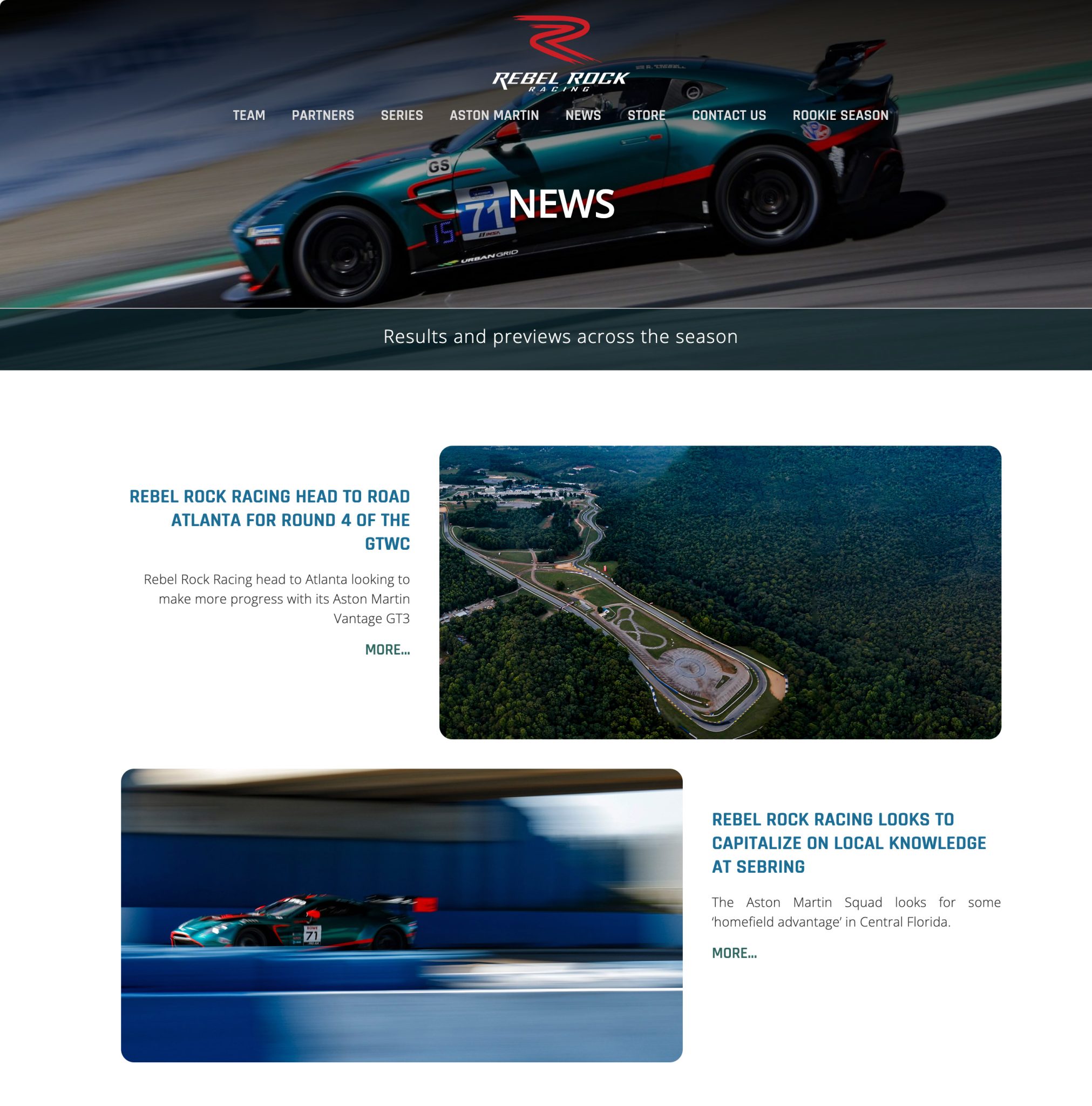
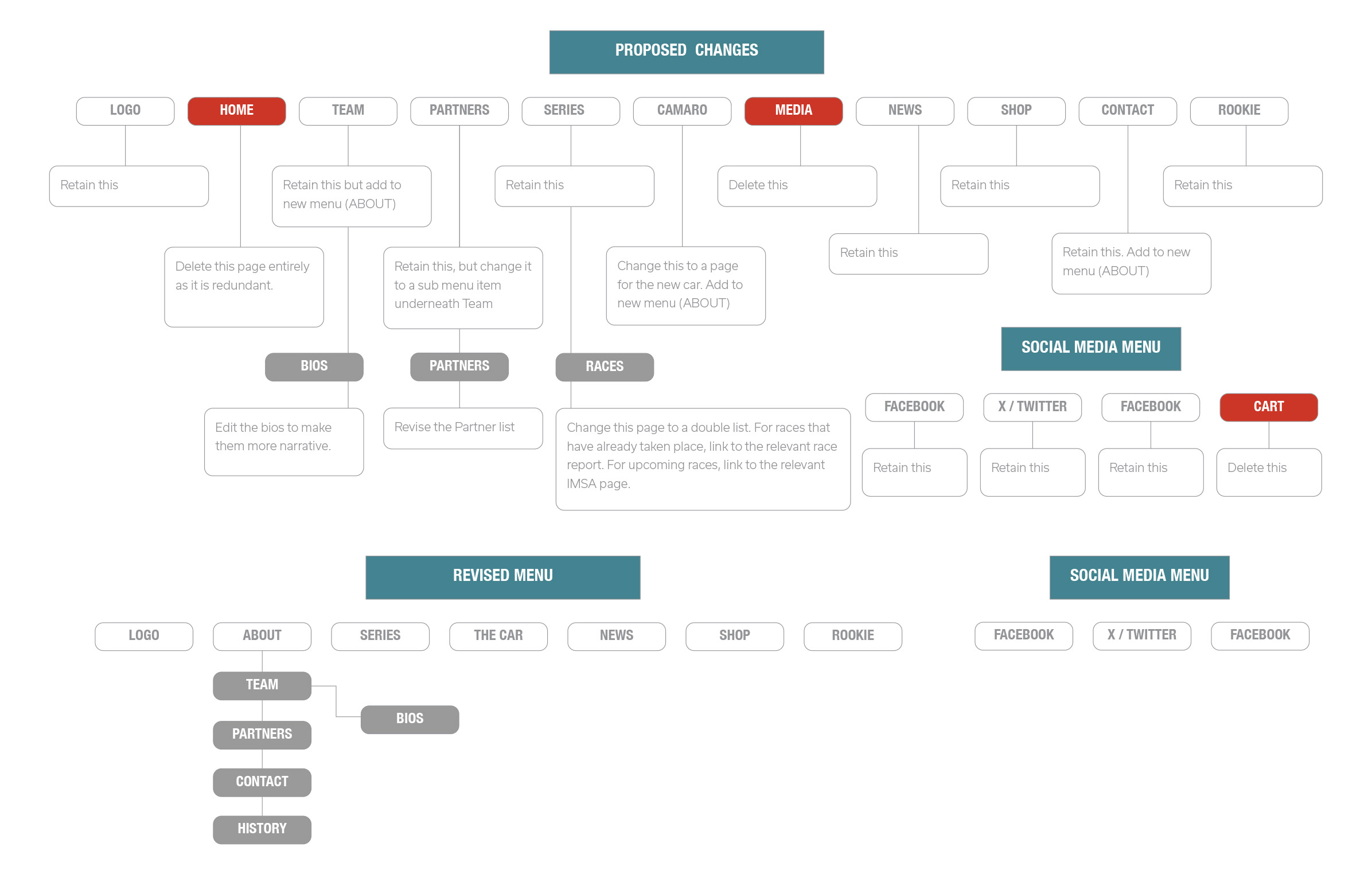
Thus in 2024 Rebel Rock Racing were looking at a seven year old website that was really showing it's age. The design seemed flat and lifeless, which is an odd thing to think about a site devoted to high-performance competitive motor racing. The content management was fine but basic.
However, the real problem lay elsewhere, out in the real world, because Rebel Rock Racing had moved on as well.
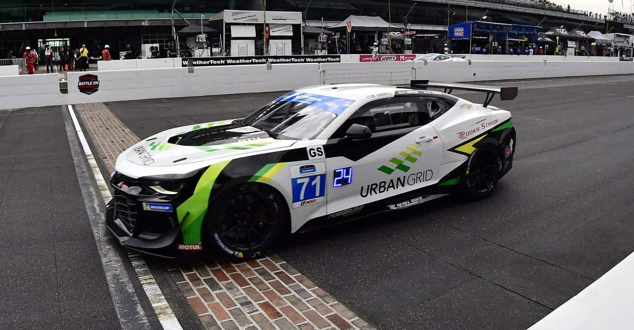
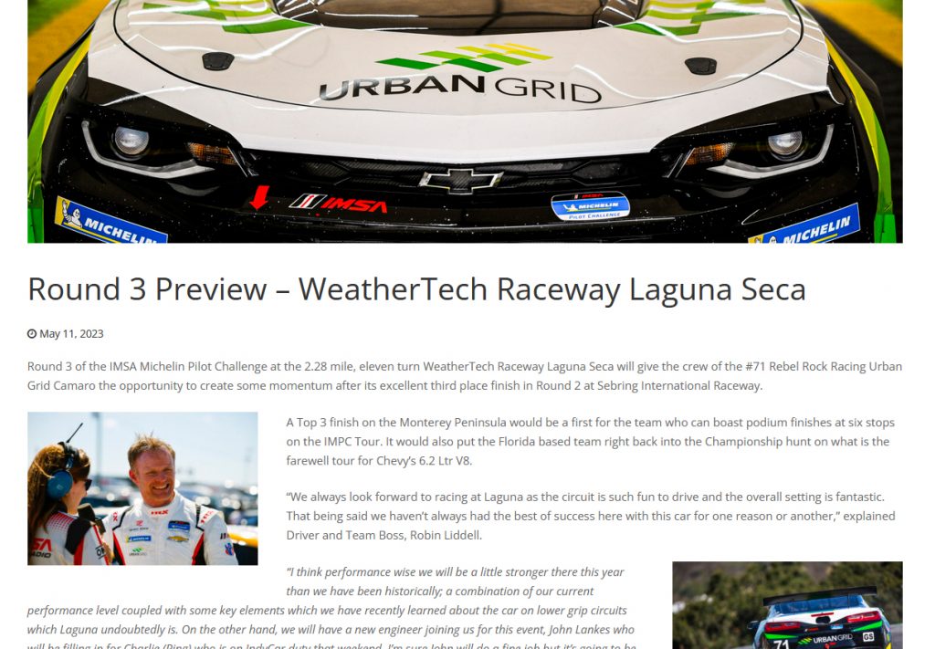
For several seasons the team had been racing in a Chevrolet Camaro GT4.R, a custom built racing car based on the road going Camaro. The Camaro should be recognisable to anyone who has watched any of the recent transformers films as the character Bumblebee, who transforms into various versions of the Camaro over the course of the films.
The livery of the car was a combination of yellow and green on a white background, which represented their sponsor at the the time.
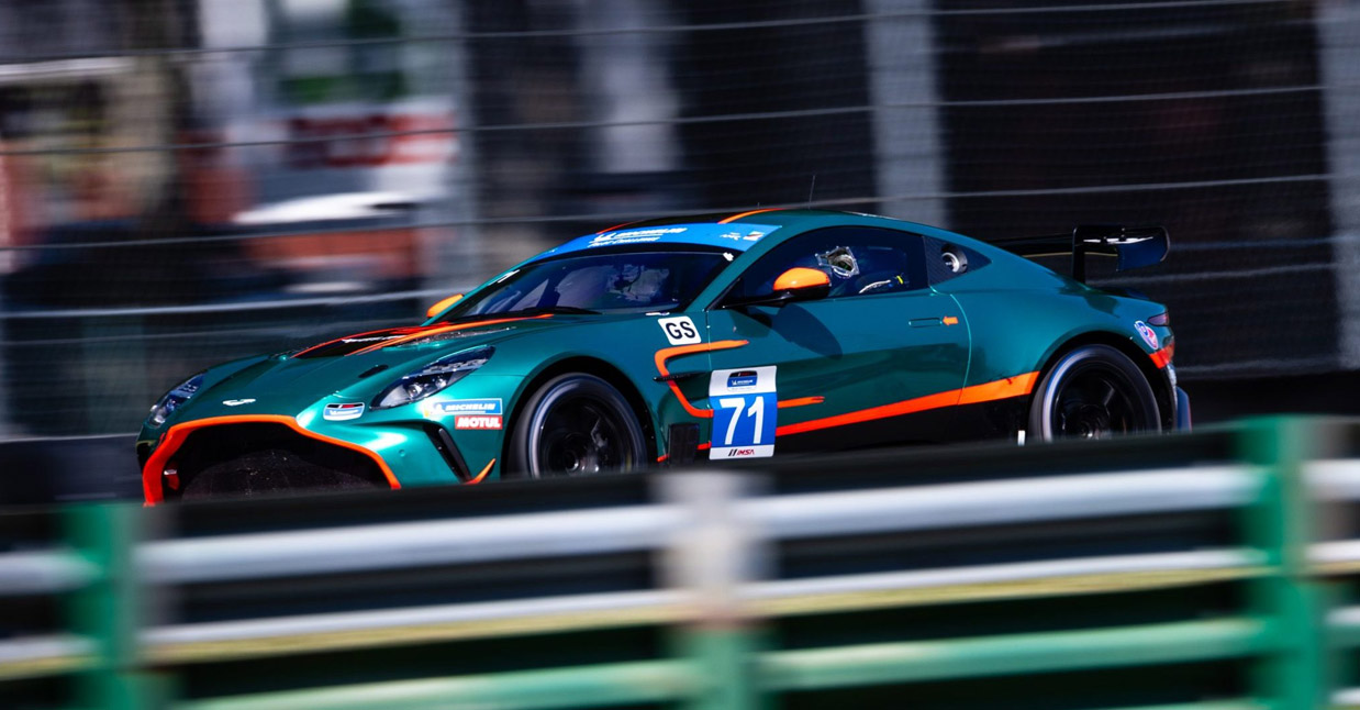
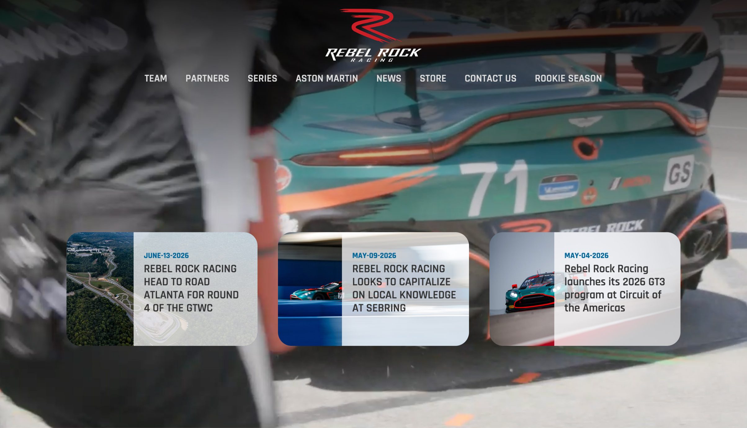
By the start of the 2024 season, the Camaro had reached the end of its production cycle. Rebel Rock transitioned to a 2024 Aston Martin Vantage GT4. Moreover, they revamped the look of the car with a striking red on green livery that paid homage to Aston Martins recent history at Le Mans.
There really could not have a been a better time to create a new look for the site.
The Audit
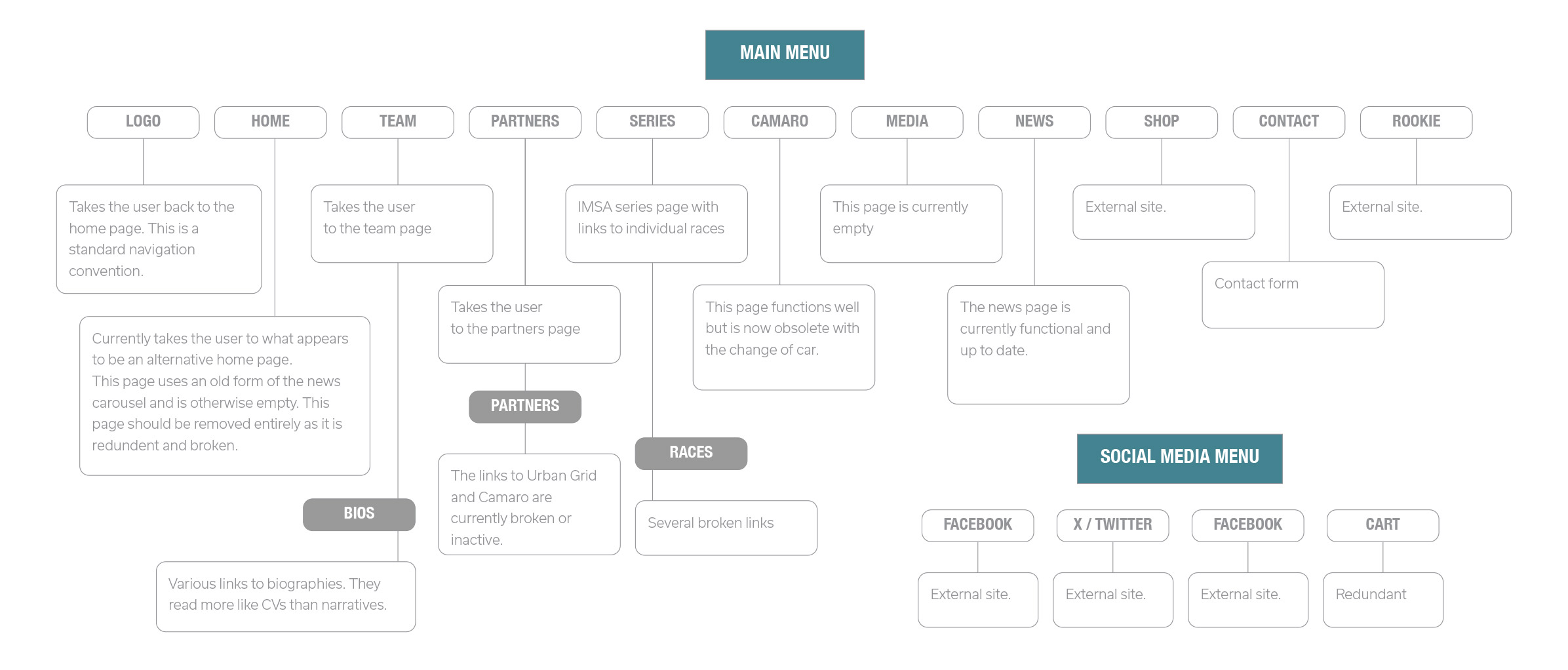
Any redesign of a website needs to start with an audit. A visual audit and a taxonomic one. So many websites end up with dead sections, incorrect classification and broken links, so every designer needs to be aware of both the form and the structure of the site; what needs to be kept, modified, and/or thrown away.
Visually it required a clean slate. Almost all of the original site was visually and structurally obsolete. The Media section had not been maintained in years, and would not be in the future. From a design perspective very little worked as it should. The typography looked dated, the layouts were flat and uninspiring, and there was very little in the way of interaction.
What the site did have was a wealth of content, and a stunningly beautiful car captured dynamically that would become the visual centrepiece of the new site. As a designer you rarely have such a treasure trove of visual assets, and you are honour bound to run with it.
The Redesign
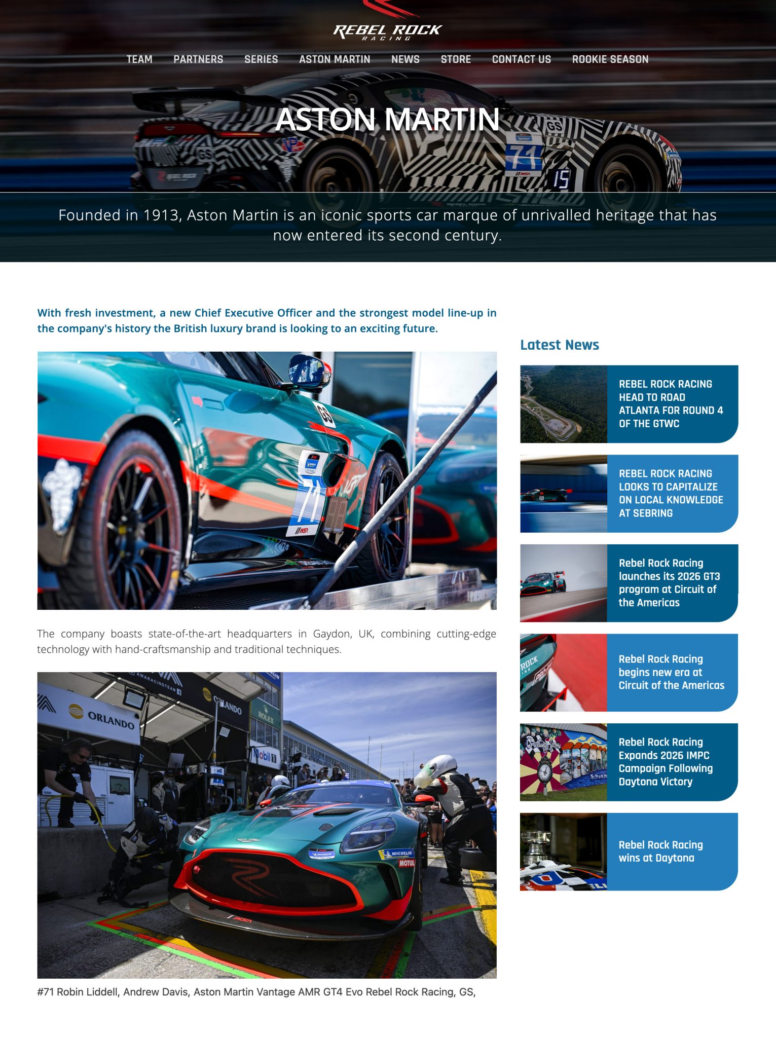
When you have visual assets as gorgeous as an Aston Martin, the design needs to be as unobtrusive as possible. There are a number of values that I have always aimed for when designing anything: elegance, propriety, and sufficiency. The site need to be simple but well styled, elegant but minimal. Everything was based around the need for the site to present the assets as well as possible.
With motor racing you only really have two options. The website can be heavily dynamic and feed into the high octane nature of the sport itself. This is almost a cinematic approach. But it's overkill for a site that already has both excellent visual assets, and an ongoing editorial component.
So we went with an approach that was a combination of corporate and editorial tropes. Plain backgrounds, minimalist design, muted colours, and elegant but simple typography.
The site's function is to be an information delivery mechanism. If the visuals are too flashy, they will only get in the way of the content.
Springfield Park Cafe – A Project About Trees
It seems that every culture loves trees. Some even worship them. I wouldn't suggest going that far, but if you wanted to, there are few better places to do it in London than Springfield Park Cafe.
When the proprietors of the Springfield Park Cafe in East London asked me to update their booklet showcasing all of the trees in the surrounding park, I was happy to take the job.
Because not every job involved inspiring subject matter. I have created print and web design for some very unappealing items. One of the first jobs I ever had back in the late eighties involved creating a catalogue for a medical facility who specialised in incontinence. Trying to find the aesthetics in that project was a real challenge.
Because this was a redesign, the structure of the brochure was more or less set. There would be minimal editorial input so the job would be to reinterpret the material.
Unusually the first thing to do was just wait. The brief was given to me in the depths of winter and I needed a sunny day in Spring in order to wander around the park with my camera.
Once I had acquired the photography that I needed the next thing to do was come up with a concept. My main concern with the previous edition was that it had not been designed to fit the medium. The booklet is only A5 and as such the large amounts of text were rendered in a somewhat cramped fashion.
This was not a problem which would ever be completely overcome. However, by eliminating excess clutter on the pages and using the differences in type to set the boundaries between data entries, I managed to clean up the layout and giving the text on the catalogues some breathing space.
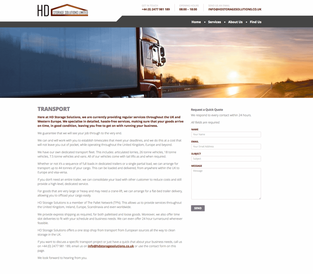
SEO driven content – design and copy for HD Storage Solutions
Creating a website for a Transport and Warehousing company based in the Midlands characterised by SEO driven content.
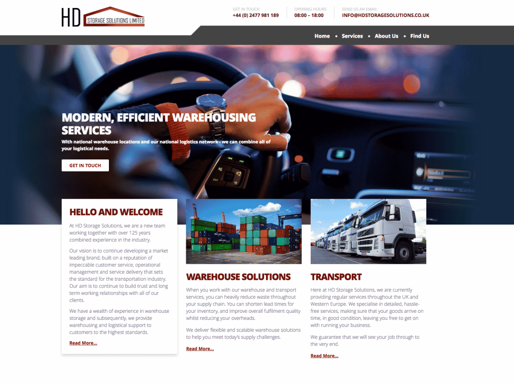
You have to admire someone who sets up a businesses during a global pandemic. This is exactly what HD Storage Solutions did in 2021, setting up a combined transport and warehousing facility near Coventry. This was one of the first projects where the need for SEO driven content was a requirement from the start.
This project began as a blank sheet. As assets go went there was a logo and that was it. No images, no copy and no real idea of how to balance the two parts of the business in marketing terms.
My biggest asset on the job was the client himself. He was open-minded and willing to listen. Moreover, he was happy for me to write the copy and to design the site with SEO as the primary driver.
Just my type
I have wanted to use Open Sans on a project for a while and this was the perfect opportunity.
Open Sans is a work of art. It can used with equal effect for headings, text, menus, buttons, and everything in-between. You can't say that about every typeface. It even works in all caps for the headlines, something that I am normally reluctant to do because it can appear to be somewhat aggressive.
Imagery came from a variety of sources. Transport by its very nature is a dynamic enterprise so the idea was to represent the idea of movement throughout.
I no longer use or encourage sliders for home page content. However, I did like the idea of rotating the underlying image at the top of the home page while keeping the copy static.
In accordance with Google's preference, I have completely moved away from the idea of single page sites. That said, a home page should contain some essential information from each section of the site. This lead to creating the horizontal content bands that run down the page with SEO driven content from each section presented in each one.
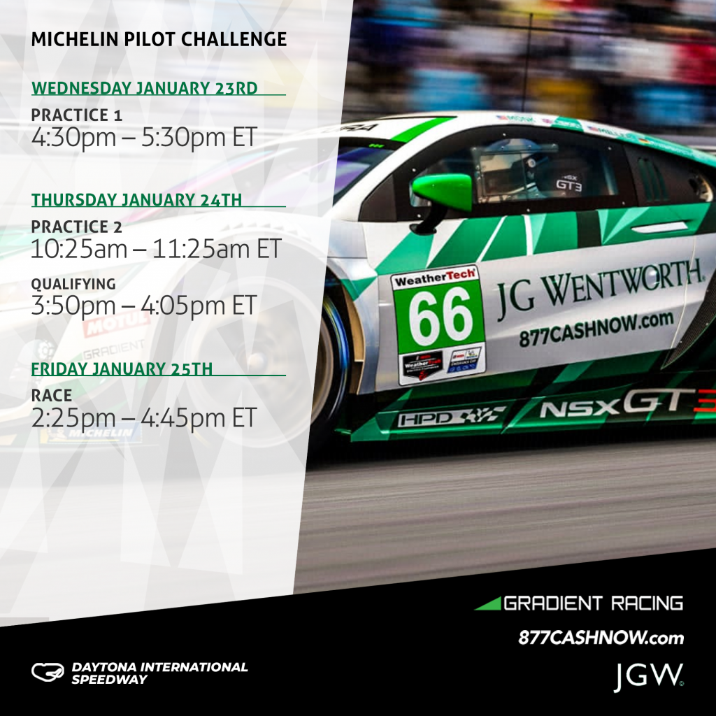
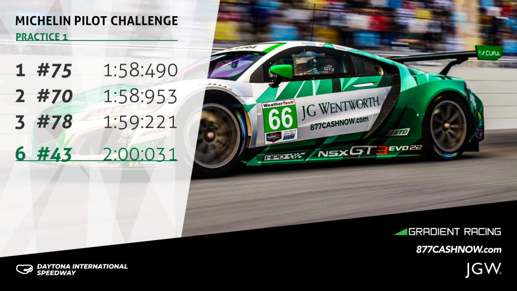
Social Media Templates for Gradient Racing – layers upon layers of design
Gradient Racing are a motor sports team with an all female driver roster. They currently compete in the IMSA WeatherTech Sports Car Championship. Their marketing agency came to me before the start of the 2024 season, looking for an adaptable series of social media templates.
The client was looking for a number of different social media templates in different sizes Portrait (1080 x 1920 pixels), Square (2025x2025 pixels), and Landscape (1920 x 1080 pixels).
We used the size above to crate social media templates for Instagram, Twitter and Facebook.
In addition, we produced the templates as layered files in Photoshop which covered:
Quotes
Race schedules
Qualifying results
Race results
I was initially inspired by the creative work for the car livery. The car was covered in a chaotic fractal pattern of various shades of green and black on a white background.
Inspired by the triangular shapes, I used a series of similar overlapping three sided shapes to mark out the separate areas of each template. Additionally, I used a similar diamond pattern of transparent white layers overlaid on images of the car for the text area.
In the end the multi layered look proved to be extremely effective. Moreover, it has become something of a signature look for the agency that commissioned me.
Branding reflects your values, but it cannot create them
If you have ever hired a business consultant, you may have heard the following. "You really should think about rebranding". If this happens early on in the first meeting you should show that consultant the door.
Rebranding in isolation is the least effective and most expensive way to build or improve your business. Even worse, it provides the appearance of radical change while leaving all of your problems and issues untouched. If branding reflects your values then you need to concentrate on the values themselves.
The rebranding process can be expensive and addictive. Most people don't get involved in the design process that often. When they do, they discover that it is fun, for want of a better word. Clients can spend hours obsessing over details. Eventually some convince themselves that the right colour, or typeface or graphic idea, will transform their business. It won‘t.
Consultants love to tell stories about Apple. They love to tout Steve Jobs as a transformative figure in industry. A man who reinvented branding. Perhaps he did. But if so it had no effect on his company's success. Apple ploughed a precarious path as a niche computer supplier for most of its existence, either with Jobs at the helm or without him.
It was the only the emergence of the iPhone and the entire smartphone industry in 2007, that turned Apple into the corporate and cultural behemoth that it is today. The success of the iPhone and iPad had a knock-on effect whereby purchasing an Apple laptop became a similar cultural statement. It was the product line that drove the transformation, not the branding.
For all Apples marketing speak about thinking differently, they are still just a technology company, faced with the same research and logistics challenges as all of their competitors. For all their talk of brand values they are driven by profit and loss, just like every other corporation.
What is the opposite of an apple?
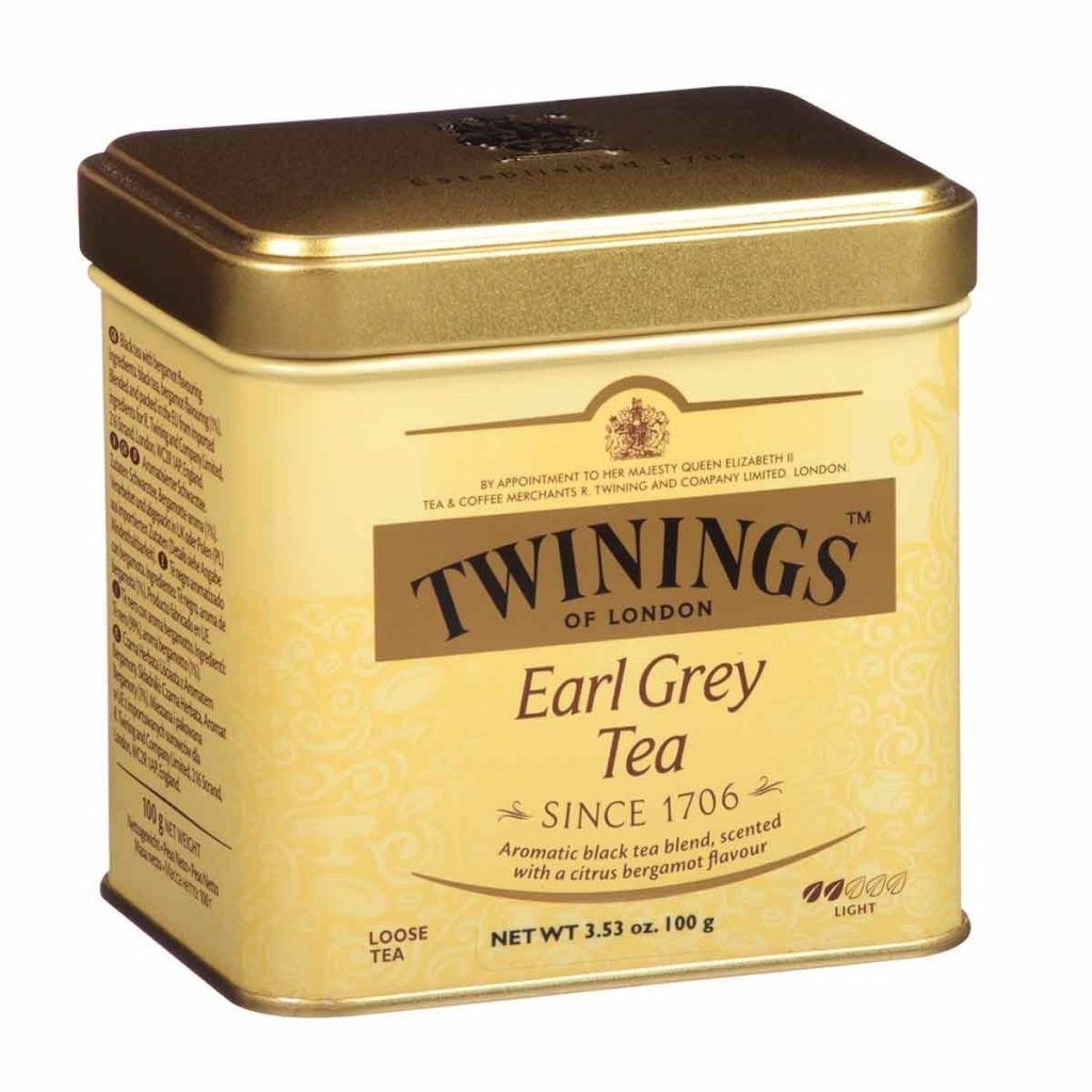
Rebranding is totally unnecessary if your products are good enough. The oldest unchanged logo in the world belongs to Twinings. Now Twinings are something of an expert on building things to last. After all they have been operating a tea room on the strand for over 300 years.
They created their logo in 1787 and it remains the same to this day. It remains the same, even in this era of planned obsolescence, where things are thrown out and replaced not because they are no longer useful, but they are no longer fashionable.
If you tried to sell a similar design to a client in 2020, they would laugh at you. It's typography includes an old fashioned serif typeface set on a shallow arc and presented in monochrome. This is most untrendy and has been for a long time. Despite this, it has never prevented a single teabag from being sold.
Twinings have no pressure to rebrand. Their product is good enough and well established enough for them to resist market pressures to change their logo.
They are not the only ones. BMW and Coca Cola have maintained their branding more or less unchanged for a century. Now you might throw your hands up in horror at the idea that Coca Cola is a quality product. However, the reality is that if you are looking for something fizzy and sugary with little or no nutritional value, then it's hard to think of anything better than Coke.
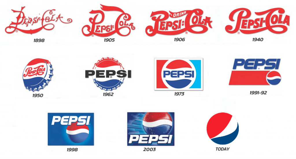
In fact, it's Coca Cola's biggest competitor, Pepsi, who have struggled with the whole notion of branding over the years. They have twisted and turned and spent billions and have not gained any ground on their bigger rival as a result.
The lesson to learn from this is that branding is only ever representational of what you are delivering. No amount of typographical tweaking will improve your goods and services, and a bad graphic will not harm your sales as long as you delivering what your clients need.
INHOUS Letting – an example of third stage corporate design
What is third stage corporate design? Stage one normally refers to establishing the brand elements such as logo, colours, and typefaces.
Stage two involves the creating the client's primary visual assets, business cards, documentation, letterhead, website, email signatures, etc.. The designer leverages the brand assets in a visually creative way but also maintains the integrity of those elements.
The third stage comes once all of those assets have already been established.
On one hand, this is less expressive than stage 1 and 2. On the other hand it requires a different kind of creativity. You have to come up with solutions that are visually arresting, communicate well, and remain faithful to the brand guidelines.
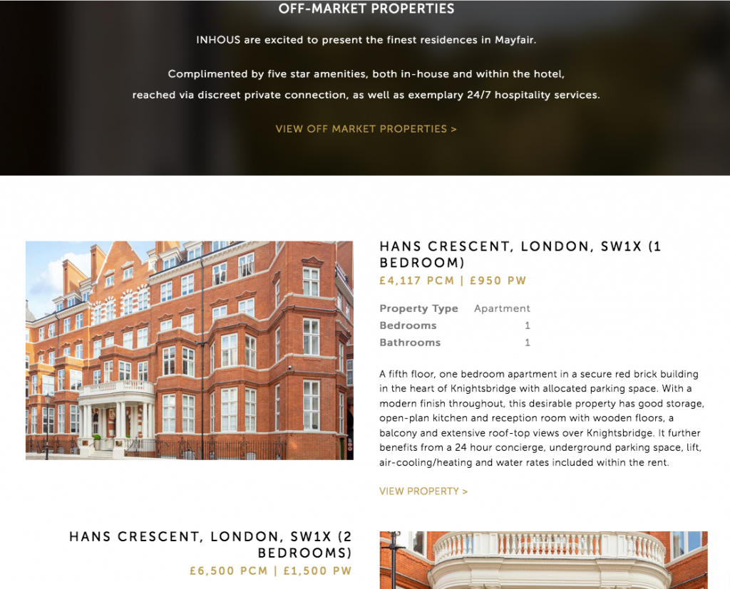
Inhous are a specialist property brokers operating in the UK and Ireland. They deal with highly valuable properties requiring specialised skills and knowledge alongside a great deal of discretion.
INHOUS decided to move into lettings alongside their existing sales service. As a result, they asked me to create layouts for letting out multiple properties.
There wouldn't be a lot of content given the expensive nature of the properties that they were offering.
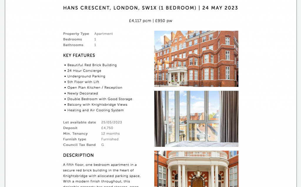
I respected the established corporate identity (as every good designer should do) by keeping to the existing website layout, colours and typography. Within those guidelines, I created an alternating layout that presented the properties in the best light.
Content updates – Rebel Rock Racing
Content updates are like a middle child, much loved but sometimes neglected. Content management systems are supposed to put content updates and creation in your client’s hands. But simply having the tools is not enough if you don’t the time or the ancilliary skills required.
This is a point that is universally true. Having a scalpel won't make me a surgeon, and owning a saw won't make me a cabinet maker. Just giving a client the keys to WordPress won’t really help them with content updates. They will also need a lot of skills that I take for granted.
Copy-writing
Asset acquisition
Editing
Layout
Photo editing
Knowledge of WordPress
A basic IT skill-set
And most importantly, the one thing that requires a bullet list all to itself.
Time
Many of my clients don't have the time or even the inclination to learn this, so they end up by asking me to do it and I am always happy to oblige.
The Rebel Rock Racing website needs regular but infrequent updates. It involves putting in a news story, a little bit of formatting, and finally adding the story to the homepage carousel.
It's a 10 minute job for me but a much longer task for my client.
The point of all this is that there is value in knowledge. It speeds up processes and enables you to present a guarantee to clients. Every story I put online quickly and accurately just adds incrementally to the most important aspect any client agency relationship, which is trust.
Update
Since I wrote this I have completed redesigned the Rebel Rock Racing website and their marketing agency has taken over content updates.
But in a more general sense, it's strange to think how outdated this post now seems. All of the above was relevant in the pre AI era. Now it seems less so.
I don't think that it is actually the case that an AI tool can replace specialist knowledge. But the promise is there, and it's a very seductive promise indeed.
Building a website and a brand at the same time – Mobile Wheel Clinic
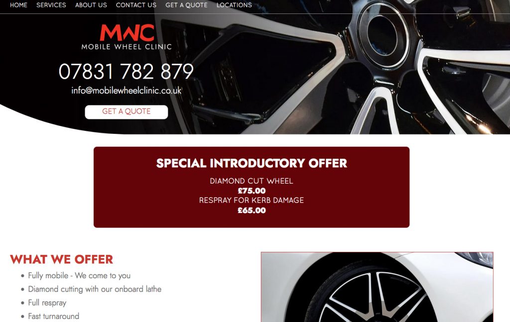
Mobile Wheel Clinic is a collaboration between one of my existing clients and a diamond wheel cutting specialist in the midlands. Building a website and a brand at the same time is not ideal but it can be done.
They came to me asking for a website. However, they also needed a corporate Identity. They didn't even have a logo at that point. So the situation required building a website and a brand at the same time.
One lesson that has stayed me for years is that a good design embodies one idea and one idea only. After a couple of false starts I realised to me that the logo should be sharp and aggressive. The company's main service is repairing wheels using a diamond sharp cutting blade mounted on a lathe and the logo had to reflect that.
So the logo became a visual expression of sharpness, and needed to be forcefully presented.
Building a website and a brand
So I went with Jost, a typeface based on Futura. It's a geometric sans serif with very sharp lines and angles. This was perfect for the Logotype. The next idea was to take the company's initials and cut sections of the lettering off. Given that cutting was the core of the company's offer, this seemed appropriate.
Finally I continued with the aggressive approach and went with black and red for the corporate colours. The client was very happy with this as they had found the alternatives to be somewhat insipid.
Once the Logo had been approved, I was asked to help with the livery for the company's main vehicle. This van would be their base of operations and as such, would be useful for advertising and brand building.
I took the idea of sharp edges and created a design underpinned by a blade running the length of the van. The most difficult thing was making sure that every aspect of the design would fit in with the various parts of the vehicle. Eventually we balanced all of the elements and the livery was complete.
This was the first opportunity to employ the logo out in the wild, as it were. I was very happy with the results.
Once I had delivered the van artwork, I returned to working on the Website. The curved blade graphic that I had used for the van turned to be an ideal fit for the website as well.
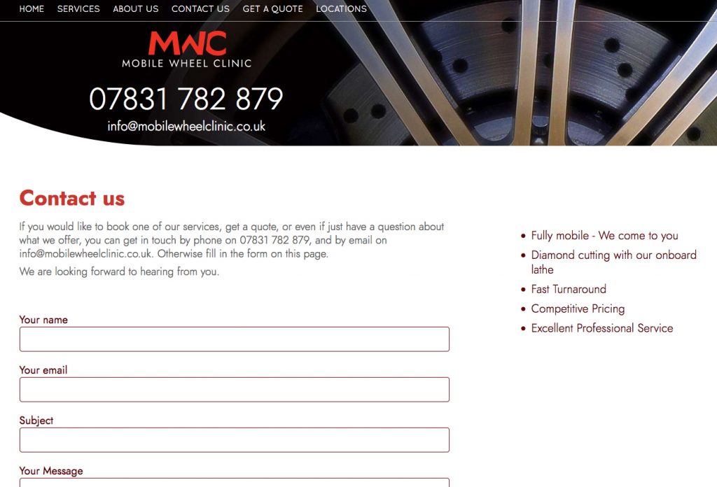
This allowed me to use a lot of diamond cut wheel imagery as background images. The images give each page its own character.
As has become increasingly common, I ended up writing all of the copy for the site as well as designing and coding it.
Victorian Pleasure Gardens History Boards
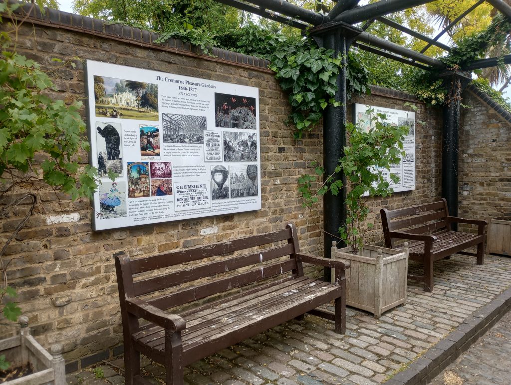
Cremorne Gardens was among the largest and most notorious of the many pleasure palaces that dotted London throughout the mid to late Victorian era. The Victorian Pleasure Gardens History Boards at Cremorne are a testament to the original park's history.
For more than three decades after it's opening in 1845, the park provided an extraordinary array of entertainments and events to the newly wealthy middle classes. They created an range of entertainments going from coffee by the river to a full-scale recreation of the battle of Sebastapol. The gardens eventually closed in 1877, due to local opposition to some the more disreputable aspects on display. Dubious pleasures such as bare knuckle boxing, gambling and prostitution. The idea of creating pleasure gardens history boards was the brainchild of a local resident.
Design
A local historian approached me with an idea to create three boards commemorating the history of the gardens. She planned to locate the boards in a gallery in the modern day Cremorne Gardens, a small public park on the banks of the Thames. This park is the last remaining tiny vestige of the original pleasure palace gardens.
She had already completed the designs but they were nowhere near the standard required for artwork. What she had produced were low resolution scamps created in Photoshop which worked as a starting point.
Artwork
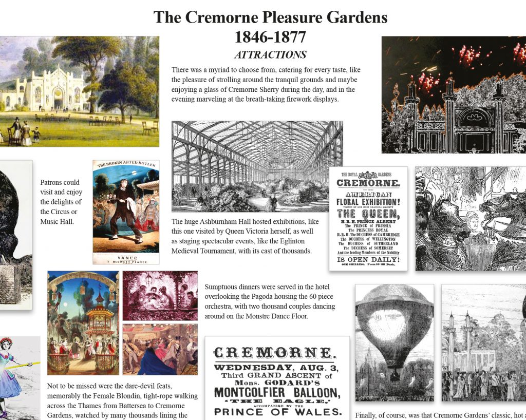
I re-created the boards from scratch, using a 12 column grid to align the somewhat chaotic elements. Grids provide a versatile structure for any changes and additions. My client was working with a number of local museums and other historians. Given the collaborative nature of the project, there were ongoing changes throughout the process.
Creating large boards on a small computer monitor means that you have no idea if they will work. Not once mounted on a wall in real size (the final artwork was 2A0).
Once the initial draft had been completed, myself and the designer went to the gardens. We were armed with a printout of one of the boards, tiled into A4 sheets. Then we spent an hour or so creating a full sized mock-up, taping the sheets onto the wall one by one.
This proved that the boards worked at full size in terms of layout and legibility.
Production
By the end we made a number of revisions and sent various versions to the banner company who would produce the final artwork. As a precaution I asked the banner company to sent me a photo of the final artwork as it came off the press. Normally I would prefer to be present as the artwork is created but that is often just not possible.
As is so often the case, the printers used one of the previous (outdated) versions of the artwork by mistake. However, this showed up on the photo and we notified the company to rectify this.