Hub Opening Poster

Creating a poster for a charity to celebrate moving into a permanent home when they moved into their permanent home

The Big Local project has provided 1 million pounds each to over 150 communities in the UK. The money goes towards grass roots projects driven by the residents themselves. The Worlds End community in West London were limited in their ambitions by the lack of a permanent base.

Moving to a new, permanent home was the point at which the project really became embedded in the local community.

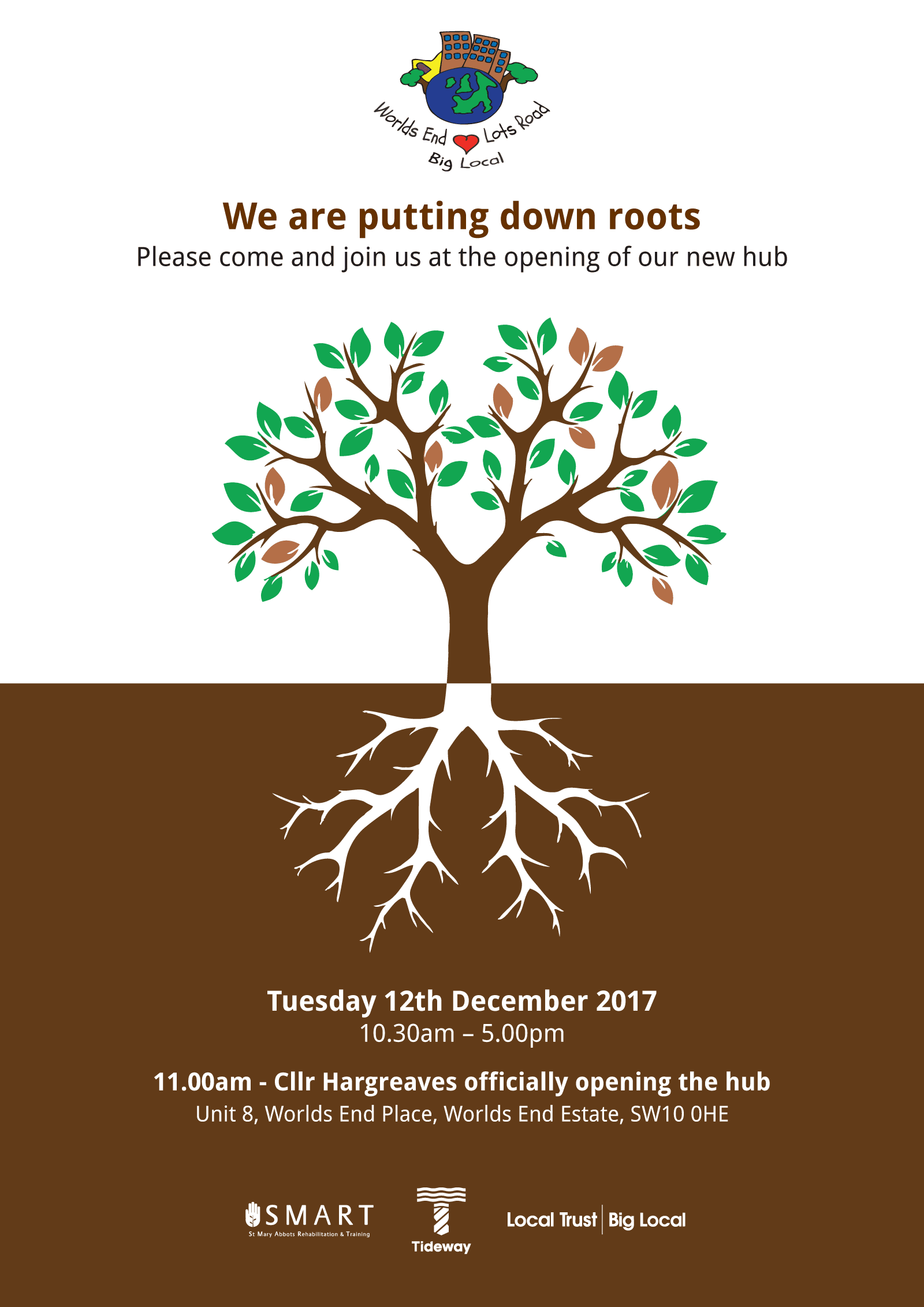
To advertise and celebrate the opening I designed and produced a poster based on the idea of putting down roots.

I amended the illustration to be single colour so that I could draw a contrast visually between the top and the bottom. The top has a white background which allows me to use the highly coloured Charity Logo.

this meant that at the bottom of the poster, I can use monochrome logos for the various companies associated with the project.

Website

Creating a website for a Transport and Warehousing company based in the Midlands.

You have to admire someone who sets up a businesses during a global pandemic. This is exactly what HD Storage Solutions did in 2021.

This project began as an almost blank sheet. As assets go went there was a logo and that was it. No images, no copy and no real idea of how to balance the two parts of the business in marketing terms.

My biggest asset on the job was the client himself. He was willing to try every idea proposed and was happy for me to write the copy and to design the site with SEO as the primary driver.

I have wanted to use Open Sans on a project for a while and this was the perfect opportunity.

Open Sans is a work of art. It can used with equal effect for headings, text, menus, buttons, and everything inbetween. You can't say that about every typeface. It even works in all caps for the headlines, something that I am normally reluctant to do because it can be a bit aggressive.

I no longer use or encourage sliders for home page content. However, I did like the idea of rotating the underlying image at the top of the home page which keeping the copy static.

By now I had completely moved away from the idea of single page sites. However, I was still of the option that the home page should contain some distillation of essential information from each section fo the site. This lead to the horizontal bands running down the page.

Website Design and Copy Writing

Building a website for a UK enterprise working with innovative companies to produce environmentally sustainable products for western markets.

IndeProducts is an international partnership looking to source the best and most innovate sustainable products in the food and tech sectors, for UK and European markets.

Starting with eBikes and following on with the latest developments in portable solar technology, the company needed a website to explain it's vision and showcase it's existing partnerships.

Sometimes you find yourself starting from a less than ideal place. In this case the Logo had been designed by the client themselves. This included both the typography and the visual of the elephant.

Both elements were visually weak and their old-fashioned feel was inappropriate for a company which was positioning itself on the junction of two ultra-modern trends, technology and eco-friendly design.

On the other hand we had some excellent product shots from several of their partners.

As is often the case, the copy of the site had not been considered prior to beginning the project.

When we started the clients were worried that too much emphasis on the partner brands would not be productive. However, I eventually managed to convince them that their connections and the networks which those partnerships demonstrated was more or less their USP.

Visually I used the idea of the flag of India's colours to frame each page. The idea of using diagonal lines came from the fact that you almost never see a flag in real life square on. It's always at an angle.

Business Cards

Following on from my creation of a logo for BD I was asked to create a business card for the partners.

I wanted to work with a purely typographic image that would be immediately recognisable while saving the rear of the card for information.

My preferred solution was to do something that you rarely see on a business card, a photograph. Failing that I wanted to reduce the typographical elements until they became a purely graphic entity.

So I ended up with cropped overlaid text from the company's logo.

The graphic flourish on the back of the card came about as a happy accident. I initially wanted to have those bleeding off the corners of the card. However the client didn't really like the visual and which I was trying to delete from the artwork I needed up reducing them by accident.

This resulted in the basis of the final image with the two corners framing the text.

Packaging Design & Artwork

Creating a packing template for a personal alarm.

Alitrac is a branding vehicle for BD Networking. Their first product was a rebranded personal alarm, combing an ultra high sound with a flashing LED. The device would be perfect for vulnerable people travelling in potential hazardous areas or situations.

Packaging comes with a unique set of challenges. Packing projects are visually dense, with a huge number of elements needing to be incorporated into a relatively small space. This makes the potential for getting the visuals and the messages lost in the sheer overload of information compressed in such a small space,

Balancing these elements while maintaining visual impact is the needle that you have to thread.

I created the packaging using colours that were sympathetic with those of the main retailer, Lloyds Pharmacy. I received some assets from the product supplier, such as the product images and a few sales shots. They also helpfully supplied an accurate dieline for the artwork

In the end I used a graphic silhouette of the egg shaped alarm to create areas of light and dark on the front and top of the package. I also drew the small icons used for the product's technical specifications.

Brand Identity

Creating a logo for a marketing consultancy specialising in new technology.

Your Brand Agency was the brainchild of a Netherlands businessman living in the UK.

The idea was simple. Finding markets for emerging technological products. Countries all over the world are getting involved in the current technological revolution. The idea was to find the best and most innovative products, no matter where the were, and integrate them into the current global marketplace.

The idea for the logo came from another failed idea. I was playing around with a symbol which was based on the letter B mirrored with itself. As I doodled this I began to notice a connection with the universal power symbol (itself a graphic representation of the numbers 1 and 0).

This led me to think that the symbol itself looks a couple of links in a chain. Eventually I came up with the idea of a very short chain made up of over overlaid power symbols.

Website Redesign

Redesigning a website for a high quality furniture retailer.

Welchome are a Chelsea based, Italian furniture retail outlet specialising in high quality home furnishings. They also offer a successful bespoke design service for business and residential interiors.

They approached me to update their website in late 2015. Their previous design was nearly six years old and was visually dated and cramped. The existing site was only partially responsive and the content management system was extremely limited.

The brief was to create a site that presented the visual quality of their products in a far more appealing fashion. They also required a comprehensive, yet simple Content Management System as they were continually updating their online catalogue with new products.

The design of the site, which had previously been cramped and visually chaotic, was pared down with white backgrounds and minimal design. The previous typeface was replaced with Raleway, a light elegant geometric web font. The colour scheme was mostly comprised of neutral greys designed to place greater emphasis on the excellent product photography.

On the home page, the layout is dominated by a full-with carousel which allows the sheer quality of Welchome's product range to shine through.

The site was built around WordPress with the basic Content Management System expanded to allow for control of products, interior design, news and catalogues.

Power Supply Product and Packaging artwork

A brief combining a brand identity and packaging for an emergency power supply for mobile phones.

Power Strike was a product in need of a brand when my client approached me with it. Even the name didn't exist.

What was there was a decent concept. A solution for when the modern world lets you down. It was a small single use battery with a couple of hours power for a mobile phone or tablet. The batteries came with connectors for either android or apple devices. The devices weighed a couple of programmes and were only a couple of inches across, it was the perfect solution of for anyone whose batteries run out when you were far from any any source of power.

I came up with the idea of PowerStrike to highlight its single use capability and the fact that it could be used in situations where every other battery option was exhausted.

I wanted to use a stark, angular, and aggressive typeface due to the nature of the product and Futura fitted the bill perfectly.

The marketing strategy was to co-brand the item for sales in football superstores across Europe so the various packaging demos included samples from Barcelona and Chelsea.

Website Redesign for Music Composer

Kyan Laslett is a commercial composer working primarily in the TV and film industries. His website provides a portfolio of his work across various platforms.

Kyan came to me because his website had three issues. The design was overly fussy, it did not work across all devices, and although it had a content management system, that system was too complicated for for a non-developer to use (which pretty much invalidates the whole point of having a CMS in the first place).<

Simplifying the visual appearance of the site made the remaining tasks easier. Minimal layouts are desirable in and of themselves. However, they also naturally lend themselves to responsive adaptation.

Each page eventually consisted of a mosaic of tiles representing Kyan's work through the years. On PCs and laptops the accompanying text would appear when the user rolled over each image. However, on tablets and phones (where there is no rollover state), the text appeared permanently underneath the images.

The CMS was tricky because the client needed to use a number of different external hosts for his Portfolio samples, Youtube, Vimeo and SoundCloud. Other posts only required still images and text. The CMS had to handle all of these smoothly while the design had to incorporate the different media seamlessly.

Avoiding Elementor

There is nothing functionally wrong with Elementor, it's more of a philosophical issue that I have with it.

Elementor is an add-on for Wordpress which allows users to build their websites using drag and drop functionality. It removes the need for coding knowledge and puts a vast array of layout options at the users fingertips.

Elementor is powerful and easy to use. It also utilises a business model that I am rather fond of, a freemium version (powerful if limited with zero cost) and a paid for version with an expansive host of plugins.

Given it's many good points, what is the problem? Or should that be what are the problems, because there are two, one for each hemisphere of my brain.

The problem with the promise of simplicity at the front end is that it requires a whole nest of complexity at the back. Elementor can produce stunning webpages, however the code that lies behind them is a vile morass of divs within divs and a chronic overload of CSS classes. It's horrible and it produces slow, unwieldy websites.

Elementor advocates will tell you otherwise, but even they have to admit that a site created in Gutenburg will run far faster than a similar looking site using Elementor.

The other problem is the sheer power of Elementor. Gutenburg by comparison gives the user far less room to maneuver in terms of layout and design. On the surface this sounds like Elementor is the better choice but in reality it is the opposite.

The bad news for most Elementor users is that access to design tools do not make you a designer. In the same way that access to a tennis rqwcquet will not turn you into Rafa Nadal.

The grim reality is that letting someone loose on a website without a proper understanding of the fundamentals of graphic design (which are a lot harder to internalise than most people realise) leads to some very bad places. The whole point of good graphic design is to communicate. An amateur armed with Elementor will only serve to obscure your message.

Even if you do get a grasp of the basics, there is no guarantee that you possess the innate talent to convert that knowledge into decent web design and layouts. In the same way that I can't dance, the hard truth is that some people cannot design and never will be able to.

But that's not the promise of Elementor. The reasoning goes that if you have the tools, somehow the talent really doesn't matter. This is wrong on every level.

So despite the promise of great code and beautiful layouts, what you actually get is bloated structure and visual crimes against good taste and communication.

So what about Gutenburg?

Gutenburg is a halfway house between the original Wordpress editor and powerhouses like Elementor. It lays out pages using simple blocks which represent the page elements, and for that reason is much closer to a page builder than the simple blog editor which it replaced.

Each block represents a structural html element like a heading, list or table. There are a limited range of drag and drop options for both the blocks themselves and for their relationship to each other.

Gutenburg is far more intuitive than it's predecessor but compare to afully fledged page editor it;s like cycxling with training wheels.

For content creators and desingers alike, this is a good thing. It allows for the creation of solid code while preventing the creators from beyttraying good design practices because they simply have less opportunity to do so.

If I sound like a design snob here it is because I am. Gutenburg pushes it's user - via its own limitations - towards creating simple, more elegant pages which load quicker and translate well between devices.

What's not to like?