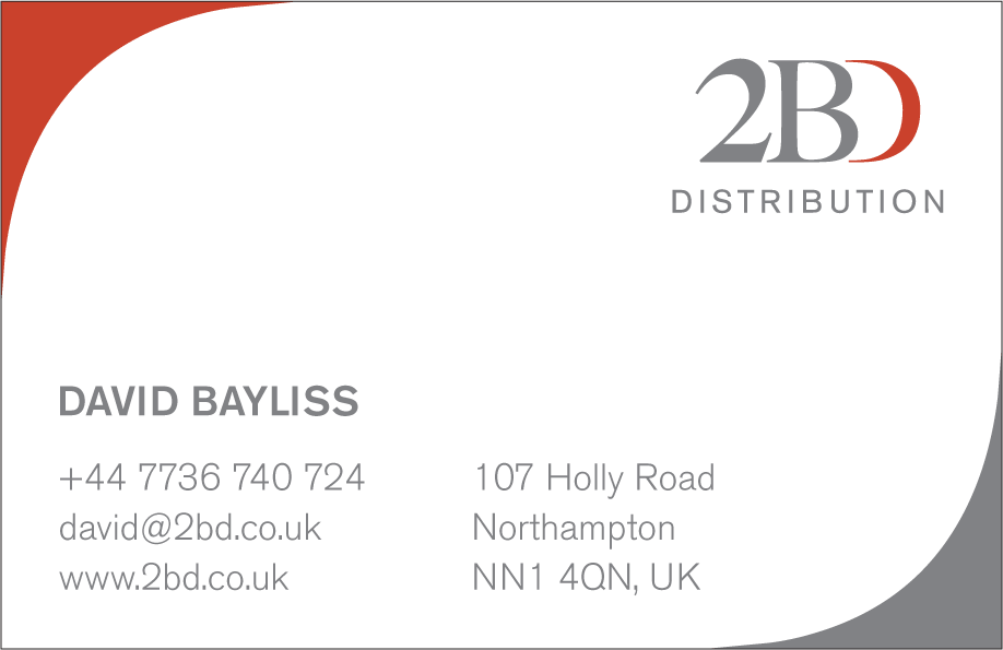
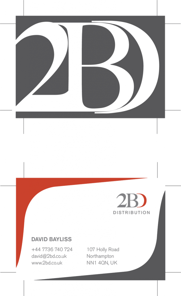
I wanted to work with a purely typographic image that would be immediately recognisable while saving the rear of the card for information.

My preferred solution was to do something that you rarely see on a business card, a photograph. Failing that I wanted to reduce the typographical elements until they became a purely graphic entity.
So I ended up with cropped overlaid text from the company's logo.

The graphic flourish on the back of the card came about as a happy accident. I initially wanted to have those bleeding off the corners of the card. However the client didn't really like the visual and which I was trying to delete from the artwork I needed up reducing them by accident.

This resulted in the basis of the final image with the two corners framing the text.
