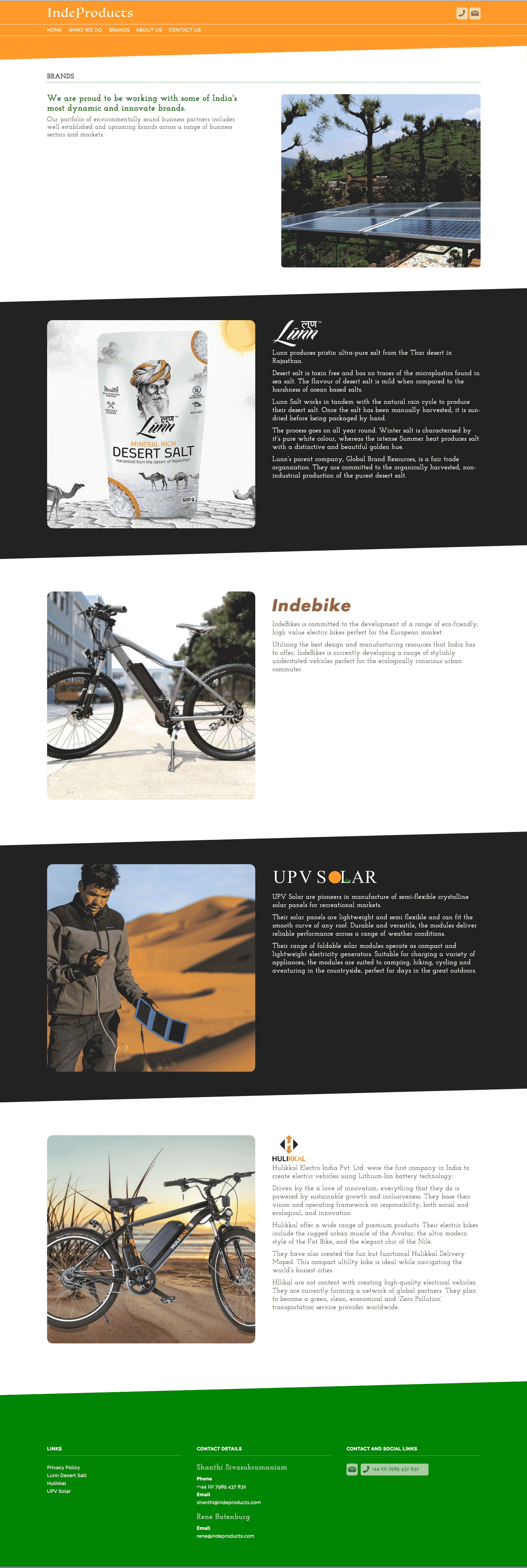
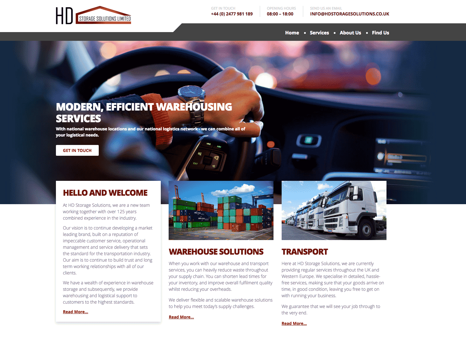
IndeProducts is an international partnership looking to source the best and most innovate sustainable products in the food and tech sectors, for UK and European markets.
Starting with eBikes and following on with the latest developments in portable solar technology, the company needed a website to explain it's vision and showcase it's existing partnerships.
Sometimes you find yourself starting from a less than ideal place. In this case the Logo had been designed by the client themselves. This included both the typography and the visual of the elephant.

Both elements were visually weak and their old-fashioned feel was inappropriate for a company which was positioning itself on the junction of two ultra-modern trends, technology and eco-friendly design.
On the other hand we had some excellent product shots from several of their partners.
As is often the case, the copy of the site had not been considered prior to beginning the project.
When we started the clients were worried that too much emphasis on the partner brands would not be productive. However, I eventually managed to convince them that their connections and the networks which those partnerships demonstrated was more or less their USP.
Visually I used the idea of the flag of India's colours to frame each page. The idea of using diagonal lines came from the fact that you almost never see a flag in real life square on. It's always at an angle.

