Website Design and Copy Writing

Building a website for a UK enterprise working with innovative companies to produce environmentally sustainable products for western markets.

IndeProducts is an international partnership looking to source the best and most innovate sustainable products in the food and tech sectors, for UK and European markets.

Starting with eBikes and following on with the latest developments in portable solar technology, the company needed a website to explain it's vision and showcase it's existing partnerships.

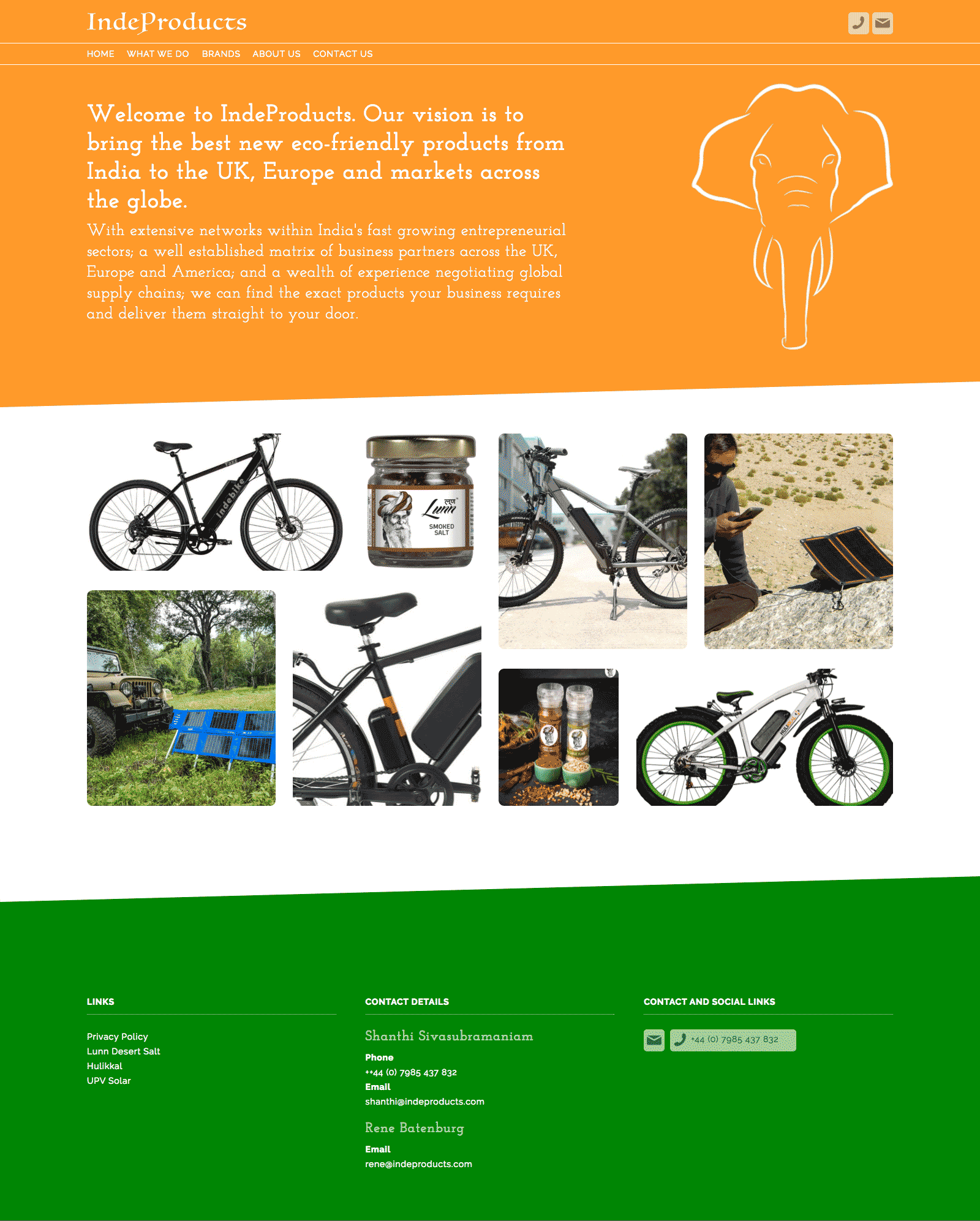
Sometimes you find yourself starting from a less than ideal place. In this case the Logo had been designed by the client themselves. This included both the typography and the visual of the elephant.

Both elements were visually weak and their old-fashioned feel was inappropriate for a company which was positioning itself on the junction of two ultra-modern trends, technology and eco-friendly design.

On the other hand we had some excellent product shots from several of their partners.

As is often the case, the copy of the site had not been considered prior to beginning the project.

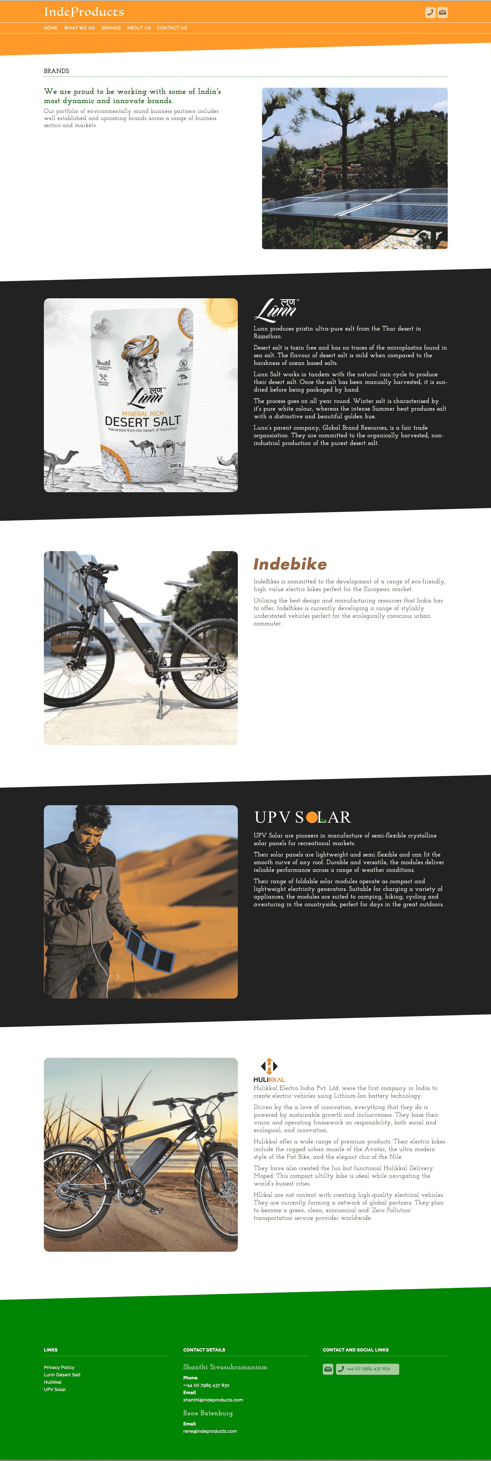
When we started the clients were worried that too much emphasis on the partner brands would not be productive. However, I eventually managed to convince them that their connections and the networks which those partnerships demonstrated was more or less their USP.

Visually I used the idea of the flag of India's colours to frame each page. The idea of using diagonal lines came from the fact that you almost never see a flag in real life square on. It's always at an angle.

Business Cards

Following on from my creation of a logo for BD I was asked to create a business card for the partners.

I wanted to work with a purely typographic image that would be immediately recognisable while saving the rear of the card for information.

My preferred solution was to do something that you rarely see on a business card, a photograph. Failing that I wanted to reduce the typographical elements until they became a purely graphic entity.

So I ended up with cropped overlaid text from the company's logo.

The graphic flourish on the back of the card came about as a happy accident. I initially wanted to have those bleeding off the corners of the card. However the client didn't really like the visual and which I was trying to delete from the artwork I needed up reducing them by accident.

This resulted in the basis of the final image with the two corners framing the text.

Packaging Design & Artwork

Creating a packing template for a personal alarm.

Alitrac is a branding vehicle for BD Networking. Their first product was a rebranded personal alarm, combing an ultra high sound with a flashing LED. The device would be perfect for vulnerable people travelling in potential hazardous areas or situations.

Packaging comes with a unique set of challenges. Packing projects are visually dense, with a huge number of elements needing to be incorporated into a relatively small space. This makes the potential for getting the visuals and the messages lost in the sheer overload of information compressed in such a small space,

Balancing these elements while maintaining visual impact is the needle that you have to thread.

I created the packaging using colours that were sympathetic with those of the main retailer, Lloyds Pharmacy. I received some assets from the product supplier, such as the product images and a few sales shots. They also helpfully supplied an accurate dieline for the artwork

In the end I used a graphic silhouette of the egg shaped alarm to create areas of light and dark on the front and top of the package. I also drew the small icons used for the product's technical specifications.

Website Redesign

Redesigning a website for a high quality furniture retailer.

Welchome are a Chelsea based, Italian furniture retail outlet specialising in high quality home furnishings. They also offer a successful bespoke design service for business and residential interiors.

They approached me to update their website in late 2015. Their previous design was nearly six years old and was visually dated and cramped. The existing site was only partially responsive and the content management system was extremely limited.

The brief was to create a site that presented the visual quality of their products in a far more appealing fashion. They also required a comprehensive, yet simple Content Management System as they were continually updating their online catalogue with new products.

The design of the site, which had previously been cramped and visually chaotic, was pared down with white backgrounds and minimal design. The previous typeface was replaced with Raleway, a light elegant geometric web font. The colour scheme was mostly comprised of neutral greys designed to place greater emphasis on the excellent product photography.

On the home page, the layout is dominated by a full-with carousel which allows the sheer quality of Welchome's product range to shine through.

The site was built around WordPress with the basic Content Management System expanded to allow for control of products, interior design, news and catalogues.

Power Supply Product and Packaging artwork

A brief combining a brand identity and packaging for an emergency power supply for mobile phones.

Power Strike was a product in need of a brand when my client approached me with it. Even the name didn't exist.

What was there was a decent concept. A solution for when the modern world lets you down. It was a small single use battery with a couple of hours power for a mobile phone or tablet. The batteries came with connectors for either android or apple devices. The devices weighed a couple of programmes and were only a couple of inches across, it was the perfect solution of for anyone whose batteries run out when you were far from any any source of power.

I came up with the idea of PowerStrike to highlight its single use capability and the fact that it could be used in situations where every other battery option was exhausted.

I wanted to use a stark, angular, and aggressive typeface due to the nature of the product and Futura fitted the bill perfectly.

The marketing strategy was to co-brand the item for sales in football superstores across Europe so the various packaging demos included samples from Barcelona and Chelsea.

Website Redesign for Music Composer

Kyan Laslett is a commercial composer working primarily in the TV and film industries. His website provides a portfolio of his work across various platforms.

Kyan came to me because his website had three issues. The design was overly fussy, it did not work across all devices, and although it had a content management system, that system was too complicated for for a non-developer to use (which pretty much invalidates the whole point of having a CMS in the first place).<

Simplifying the visual appearance of the site made the remaining tasks easier. Minimal layouts are desirable in and of themselves. However, they also naturally lend themselves to responsive adaptation.

Each page eventually consisted of a mosaic of tiles representing Kyan's work through the years. On PCs and laptops the accompanying text would appear when the user rolled over each image. However, on tablets and phones (where there is no rollover state), the text appeared permanently underneath the images.

The CMS was tricky because the client needed to use a number of different external hosts for his Portfolio samples, Youtube, Vimeo and SoundCloud. Other posts only required still images and text. The CMS had to handle all of these smoothly while the design had to incorporate the different media seamlessly.