Website

Creating a website for a Transport and Warehousing company based in the Midlands.

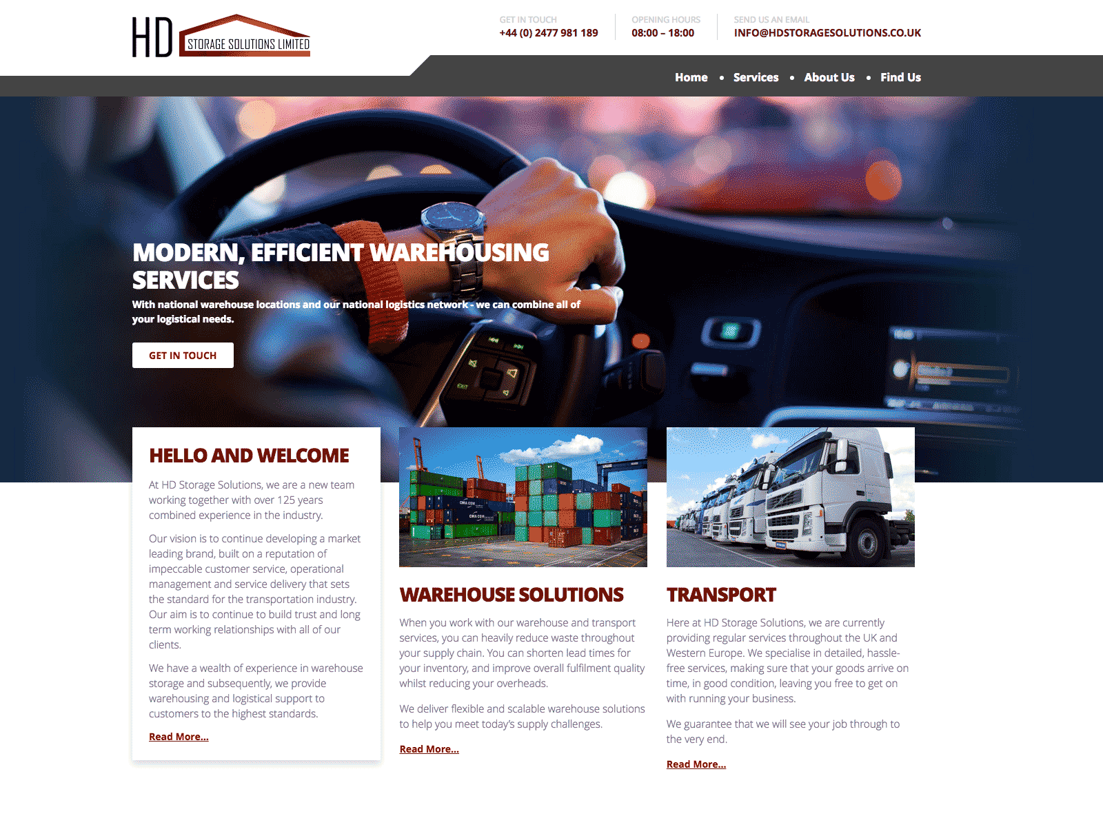
You have to admire someone who sets up a businesses during a global pandemic. This is exactly what HD Storage Solutions did in 2021.

This project began as an almost blank sheet. As assets go went there was a logo and that was it. No images, no copy and no real idea of how to balance the two parts of the business in marketing terms.

My biggest asset on the job was the client himself. He was willing to try every idea proposed and was happy for me to write the copy and to design the site with SEO as the primary driver.

I have wanted to use Open Sans on a project for a while and this was the perfect opportunity.

Open Sans is a work of art. It can used with equal effect for headings, text, menus, buttons, and everything inbetween. You can't say that about every typeface. It even works in all caps for the headlines, something that I am normally reluctant to do because it can be a bit aggressive.

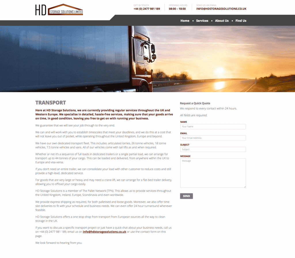
I no longer use or encourage sliders for home page content. However, I did like the idea of rotating the underlying image at the top of the home page which keeping the copy static.

By now I had completely moved away from the idea of single page sites. However, I was still of the option that the home page should contain some distillation of essential information from each section fo the site. This lead to the horizontal bands running down the page.

Website Design and Copy Writing

Building a website for a UK enterprise working with innovative companies to produce environmentally sustainable products for western markets.

IndeProducts is an international partnership looking to source the best and most innovate sustainable products in the food and tech sectors, for UK and European markets.

Starting with eBikes and following on with the latest developments in portable solar technology, the company needed a website to explain it's vision and showcase it's existing partnerships.

Sometimes you find yourself starting from a less than ideal place. In this case the Logo had been designed by the client themselves. This included both the typography and the visual of the elephant.

Both elements were visually weak and their old-fashioned feel was inappropriate for a company which was positioning itself on the junction of two ultra-modern trends, technology and eco-friendly design.

On the other hand we had some excellent product shots from several of their partners.

As is often the case, the copy of the site had not been considered prior to beginning the project.

When we started the clients were worried that too much emphasis on the partner brands would not be productive. However, I eventually managed to convince them that their connections and the networks which those partnerships demonstrated was more or less their USP.

Visually I used the idea of the flag of India's colours to frame each page. The idea of using diagonal lines came from the fact that you almost never see a flag in real life square on. It's always at an angle.

Packaging Design & Artwork

Creating a packing template for a personal alarm.

Alitrac is a branding vehicle for BD Networking. Their first product was a rebranded personal alarm, combing an ultra high sound with a flashing LED. The device would be perfect for vulnerable people travelling in potential hazardous areas or situations.

Packaging comes with a unique set of challenges. Packing projects are visually dense, with a huge number of elements needing to be incorporated into a relatively small space. This makes the potential for getting the visuals and the messages lost in the sheer overload of information compressed in such a small space,

Balancing these elements while maintaining visual impact is the needle that you have to thread.

I created the packaging using colours that were sympathetic with those of the main retailer, Lloyds Pharmacy. I received some assets from the product supplier, such as the product images and a few sales shots. They also helpfully supplied an accurate dieline for the artwork

In the end I used a graphic silhouette of the egg shaped alarm to create areas of light and dark on the front and top of the package. I also drew the small icons used for the product's technical specifications.

Website Redesign

Redesigning a website for a high quality furniture retailer.

Welchome are a Chelsea based, Italian furniture retail outlet specialising in high quality home furnishings. They also offer a successful bespoke design service for business and residential interiors.

They approached me to update their website in late 2015. Their previous design was nearly six years old and was visually dated and cramped. The existing site was only partially responsive and the content management system was extremely limited.

The brief was to create a site that presented the visual quality of their products in a far more appealing fashion. They also required a comprehensive, yet simple Content Management System as they were continually updating their online catalogue with new products.

The design of the site, which had previously been cramped and visually chaotic, was pared down with white backgrounds and minimal design. The previous typeface was replaced with Raleway, a light elegant geometric web font. The colour scheme was mostly comprised of neutral greys designed to place greater emphasis on the excellent product photography.

On the home page, the layout is dominated by a full-with carousel which allows the sheer quality of Welchome's product range to shine through.

The site was built around WordPress with the basic Content Management System expanded to allow for control of products, interior design, news and catalogues.

Power Supply Product and Packaging artwork

A brief combining a brand identity and packaging for an emergency power supply for mobile phones.

Power Strike was a product in need of a brand when my client approached me with it. Even the name didn't exist.

What was there was a decent concept. A solution for when the modern world lets you down. It was a small single use battery with a couple of hours power for a mobile phone or tablet. The batteries came with connectors for either android or apple devices. The devices weighed a couple of programmes and were only a couple of inches across, it was the perfect solution of for anyone whose batteries run out when you were far from any any source of power.

I came up with the idea of PowerStrike to highlight its single use capability and the fact that it could be used in situations where every other battery option was exhausted.

I wanted to use a stark, angular, and aggressive typeface due to the nature of the product and Futura fitted the bill perfectly.

The marketing strategy was to co-brand the item for sales in football superstores across Europe so the various packaging demos included samples from Barcelona and Chelsea.