A Return to Rebel Rock
In some ways, this can be adapted for how websites atrophy over time. The site remains the same but the internet has changed.
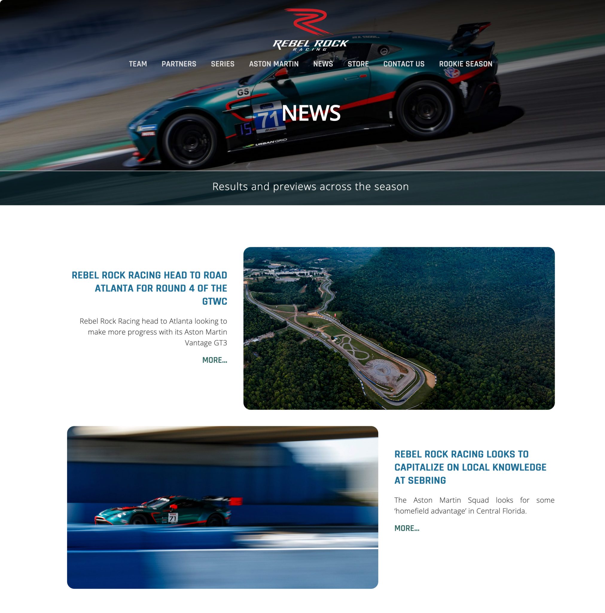
It's strange, but true, how a good website becomes a bad website simply by being left alone. Lack of maintenance can lead to broken links and weakened sitemaps. A lack of new content will inevitably render the site increasingly irrelevant to consumers. But even if you are maintaining and updating your site regularly, the reality is the internet itself keeps changing.
Coding practices change, and browser support for certain coding patterns will diminish. Design and UI/UX trends will gradually iterate into something that leaves your site looking tired and outmoded. The algorithm moves on, and browsing habits change accordingly.
It doesn't happen overnight, but it will happen sooner or later.
Rebel Rock Racing
Thus in 2024 Rebel Rock Racing were looking at a seven year old website that was really showing it's age. The design seemed flat and lifeless, which is an odd thing to think about a site devoted to high-performance competitive motor racing. The content management was fine but basic.
However, the real problem lay elsewhere, out in the real world, because Rebel Rock Racing had moved on as well.
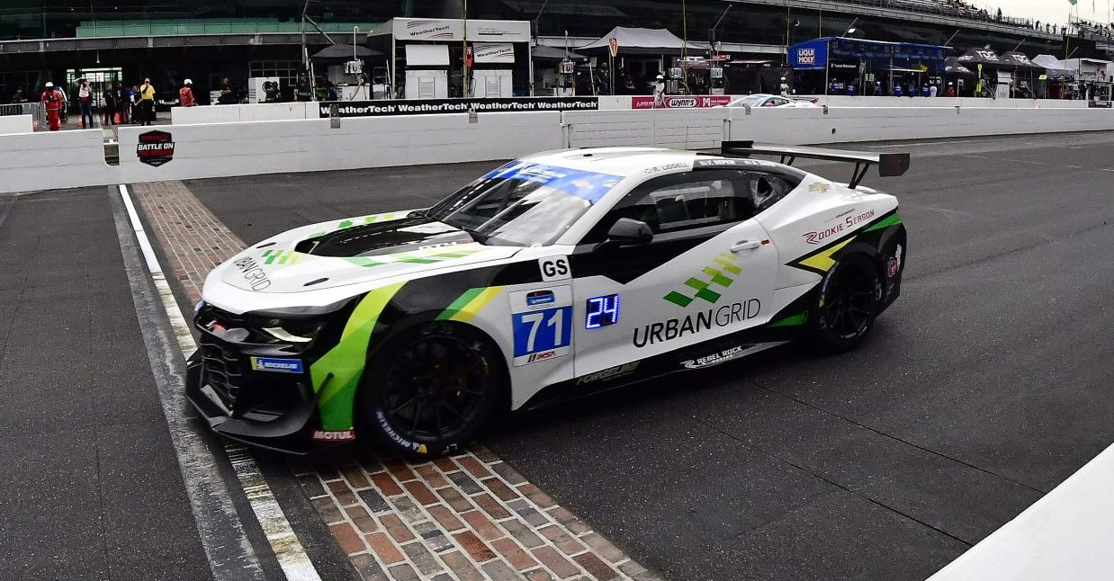
For several seasons the team had been racing in a Chevrolet Camaro GT4.R, a custom built racing car based on the road going Camaro. The Camaro should be recognisable to anyone who has watched any of the recent transformers films as the character Bumblebee, who transforms into various versions of the Camaro over the course of the films.
The livery of the car was a combination of yellow and green on a white background, which represented their sponsor at the the time.
By the start of the 2024 season, the Camaro had reached the end of its production cycle. Rebel Rock transitioned to a 2024 Aston Martin Vantage GT4. Moreover, they revamped the look of the car with a striking red on green livery that paid homage to Aston Martins recent history at Le Mans.
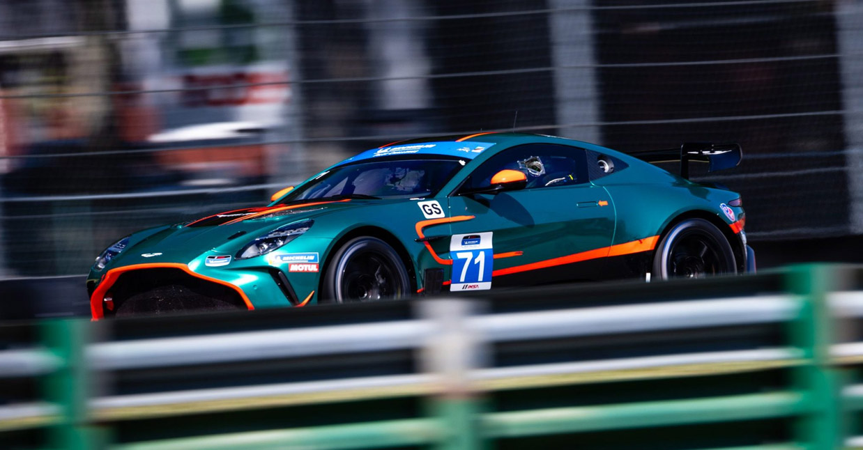
There really could not have a been a better time to create a new look for the site.
The Audit
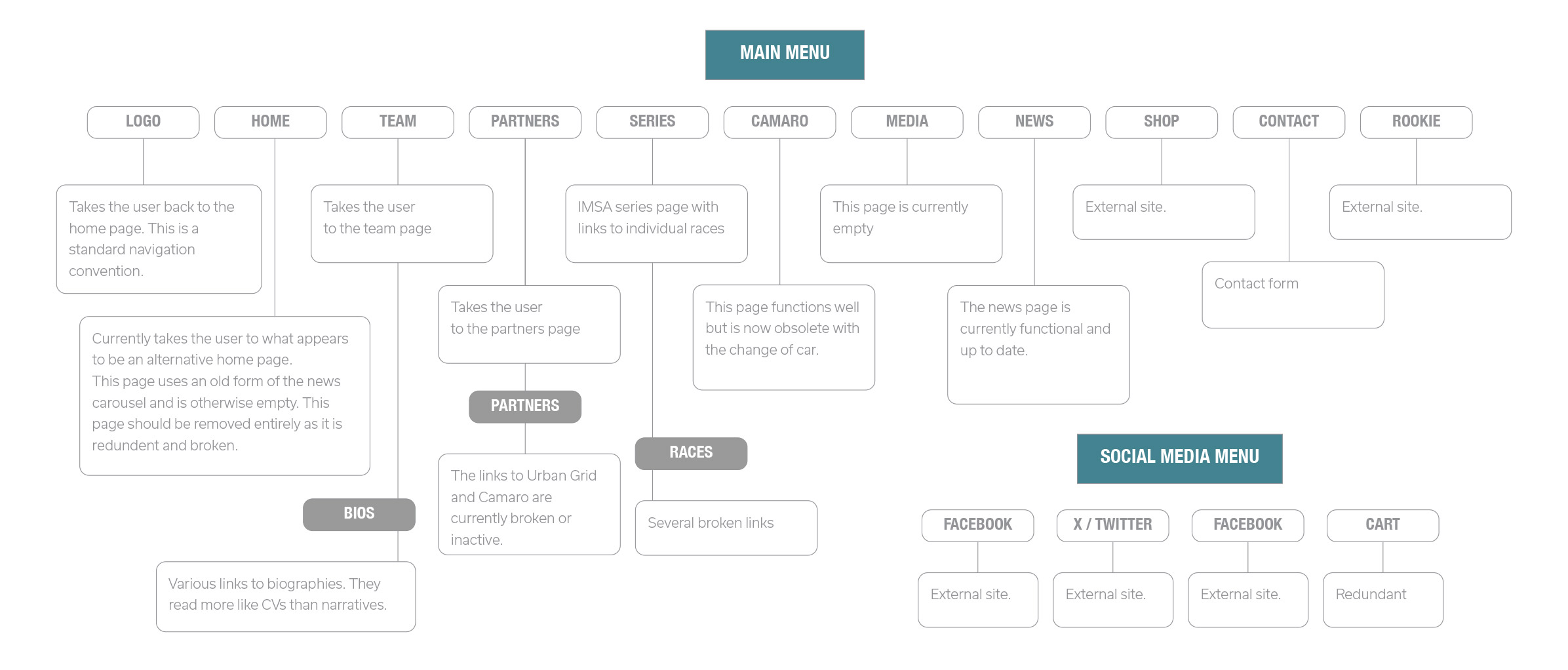
Any redesign of a website needs to start with an audit. A visual audit and a taxonomic one. So many websites end up with dead sections, incorrect classification and broken links, so every designer needs to be aware of both the form and the structure of the site; what needs to be kept, modified, and/or thrown away.
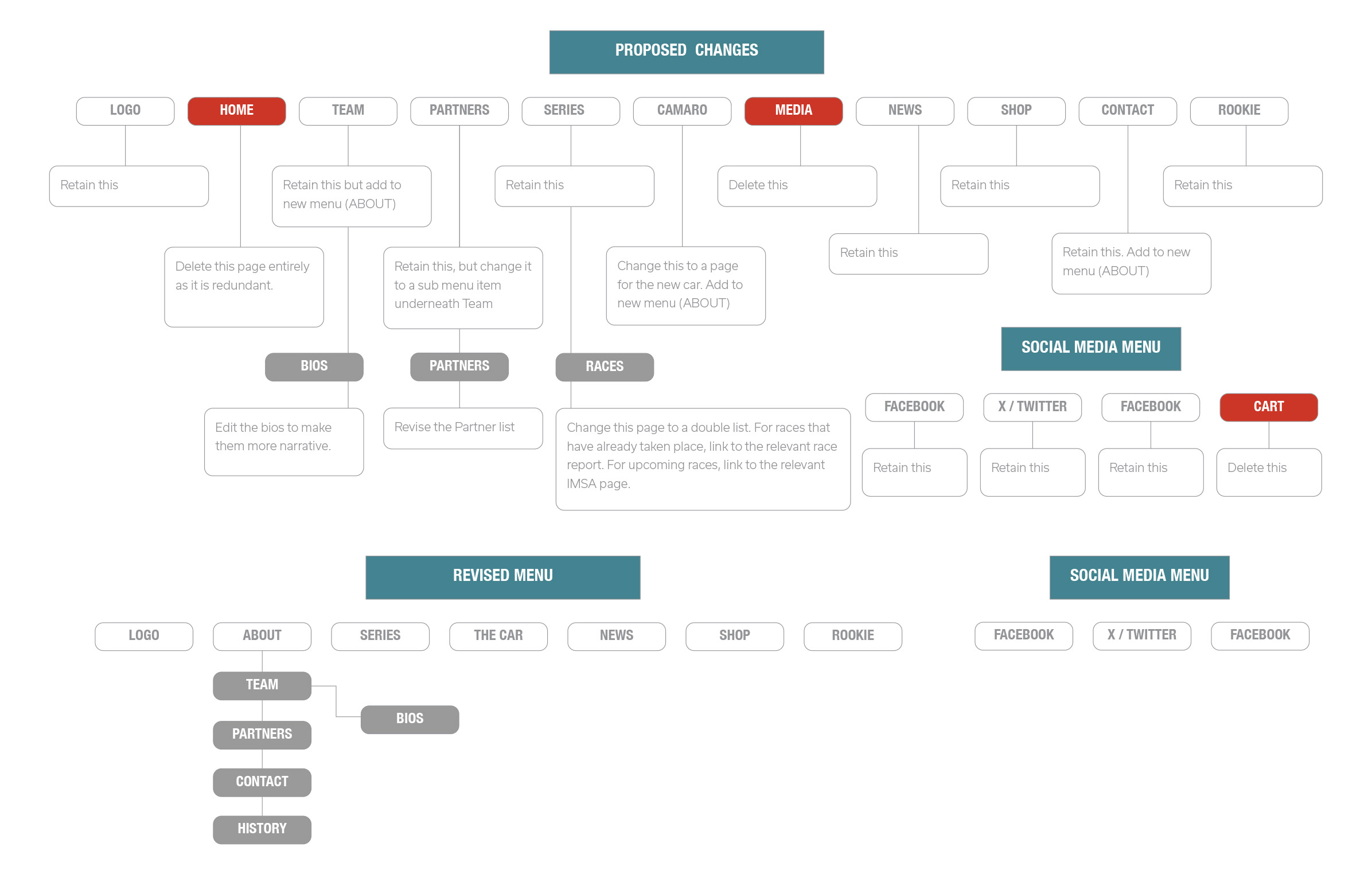
Visually it required a clean slate. Almost all of the original site was visually and structurally obsolete. The Media section had not been maintained in years, and would not be in the future. From a design perspective very little worked as it should. The typography looked dated, the layouts were flat and uninspiring, and there was very little in the way of interaction.
What the site did have was a wealth of content, and a stunningly beautiful car captured dynamically that would become the visual centrepiece of the new site. As a designer you rarely have such a treasure trove of visual assets, and you are honour bound to run with it.
The Redesign
When you have visual assets as gorgeous as an Aston Martin, the design needs to be as unobtrusive as possible. There are a number of values that I have always aimed for when designing anything: elegance, propriety, and sufficiency. The site need to be simple but well styled, elegant but minimal. Everything was based around the need for the site to present the assets as well as possible.
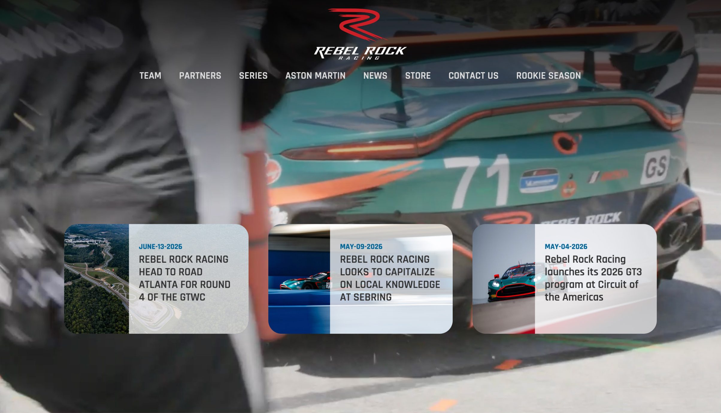
With motor racing you only really have two options. The website can be heavily dynamic and feed into the high octane nature of the sport itself. This is almost a cinematic approach. But it's overkill for a site that already has both excellent visual assets, and an ongoing editorial component.
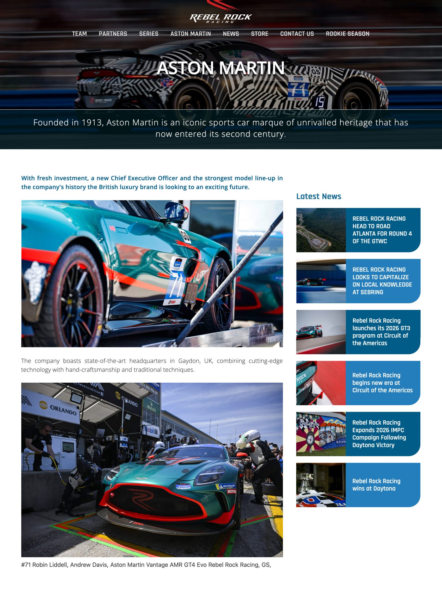
So we went with an approach that was a combination of corporate and editorial tropes. Plain backgrounds, minimalist design, muted colours, and elegant but simple typography.
The site's function is to be an information delivery mechanism. If the visuals are too flashy, they will only get in the way of the content.